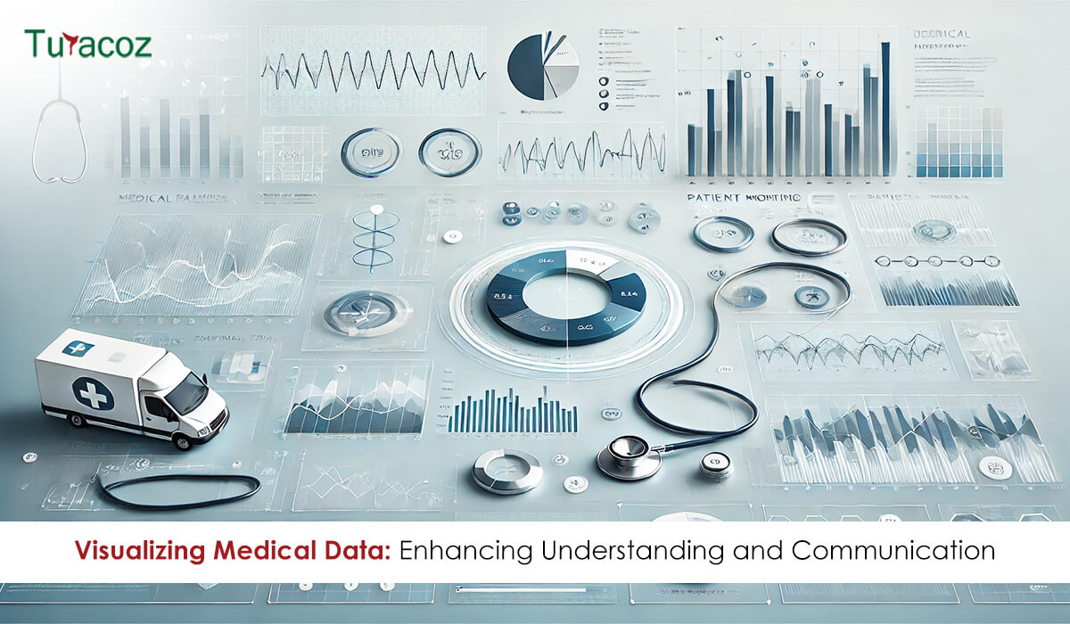
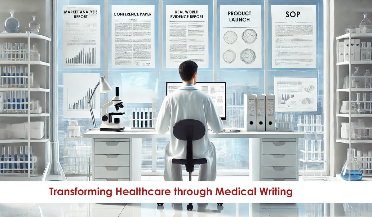
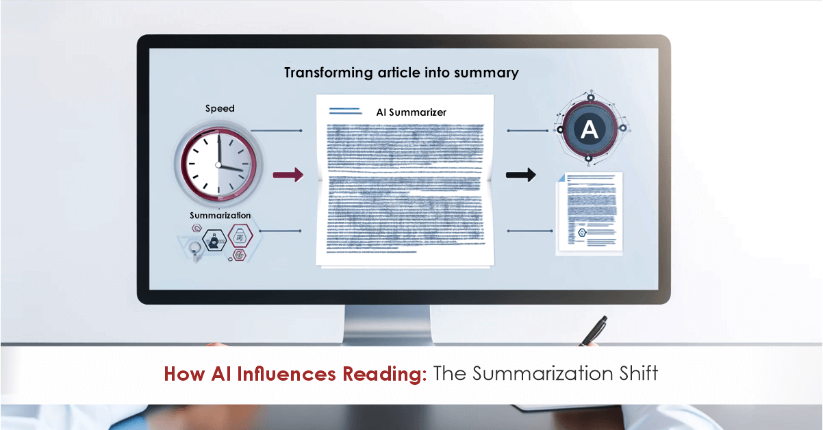
In medical and scientific writing, effectively communicating complex information is vital to ensuring that research findings, clinical data, and patient outcomes are clearly understood. As data becomes more abundant, healthcare professionals and researchers are increasingly relying on data visualization as a key tool for simplifying complex datasets. For medical writers, data visualization can transform written content into visually engaging and informative material that enhances comprehension and decision-making.
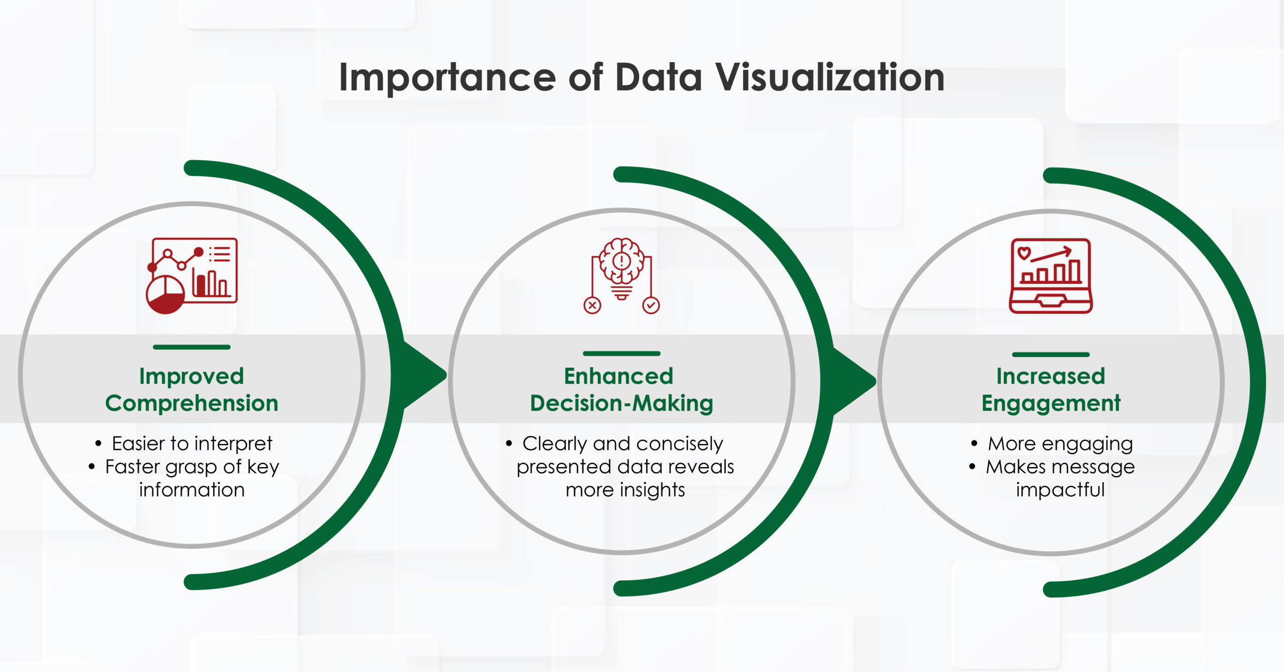
The Importance of Data Visualization
How Data Visualization is Used in Healthcare
In healthcare, data visualization is used in various ways, from monitoring patient health to evaluating healthcare system performance. Medical writers often contribute to these processes by creating documents and reports that incorporate visual elements, helping different stakeholders—healthcare providers, researchers, and patients—make sense of the data.
For medical writers, understanding the role of visualization in healthcare allows them to craft content that aligns with the needs of healthcare providers and researchers while making complex data more accessible.
Infographics for Visualizing Medical Data
Infographics have become a powerful tool for medical writers to communicate data in a more engaging format. By combining visual elements like charts, icons, and text, infographics present data in a way that is easy to understand. This is particularly important in medical writing, where the audience can range from highly specialized clinicians to patients with limited medical knowledge.
For medical writers, infographics serve multiple purposes:
Incorporating infographics into medical writing not only enhances clarity but also increases the likelihood that the content will be shared and referenced, broadening its reach and impact.
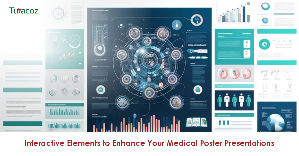
Posters in Hallways and Doctors’ Offices: A Thing of the Past?
For many years, posters in hospitals, doctors’ offices, and clinic hallways served as a primary way to communicate health information. However, in today’s digital age, static posters are being replaced by more dynamic and interactive forms of data visualization. Medical writers now can move beyond traditional posters and embrace digital communication tools, such as:
While posters may still have a role in certain settings, digital tools allow medical writers to create more dynamic, customizable content that can be easily updated and widely distributed.
Graphical Reports on Clinical Data and Performance
Medical writers play a crucial role in creating these reports, which often include:
By using graphical elements, medical writers can ensure that clinical reports are not only informative but also visually engaging, making it easier for healthcare professionals to absorb and act on the information.
How to Implement Data Visualization in the Healthcare Sector
Implementing data visualization in the healthcare sector requires careful planning and collaboration among various stakeholders. Medical writers can play a key role in this implementation by following these steps:
Read More: Navigating Predatory Publishing in Medical Communications: A Comprehensive Guide
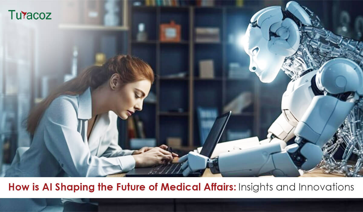
AI and the Future of Healthcare
Artificial intelligence (AI) is revolutionizing healthcare, and data visualization is no exception. AI can process vast amounts of data, identify patterns, and present insights in visual formats that are easy to interpret. For medical writers, this means that AI-driven tools can assist in creating more sophisticated and predictive visualizations.
Conclusion
Data visualization is an indispensable tool in modern healthcare, offering a way to simplify complex data and communicate it effectively to a wide range of audiences. Medical writers, as key facilitators of healthcare communication, can harness the power of data visualization to enhance their content, making it more accessible, engaging, and impactful. As AI continues to shape the future of healthcare, the role of data visualization will only grow, creating exciting opportunities for medical writers to further improve how healthcare data is presented and understood.
Tags: #MedicalWriting
Why Short-Form Pharma Content is About Narrative, Not Format High-impact communication is fundamentally about narrative. The right question is not
Breast cancer remains one of the most significant health challenges for women worldwide. In 2022, it caused around 670,000 deaths

“Write the paper as though no editor will ever see it … then let a good editor make sure everyone
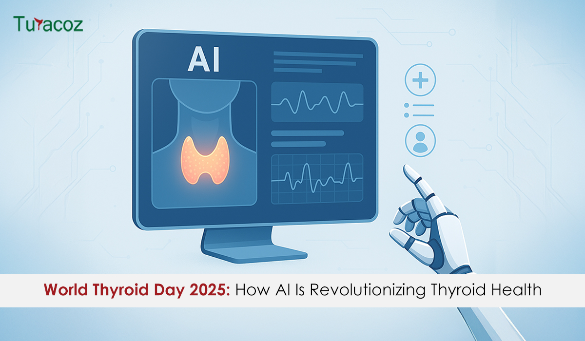
World Thyroid Day invites us to appreciate the tiny, butterfly-shaped gland with a big job in managing our body’s energy,
In an era where speed, efficiency, and personalization have become imperatives, Artificial Intelligence (AI) — particularly machine learning, AI algorithms,
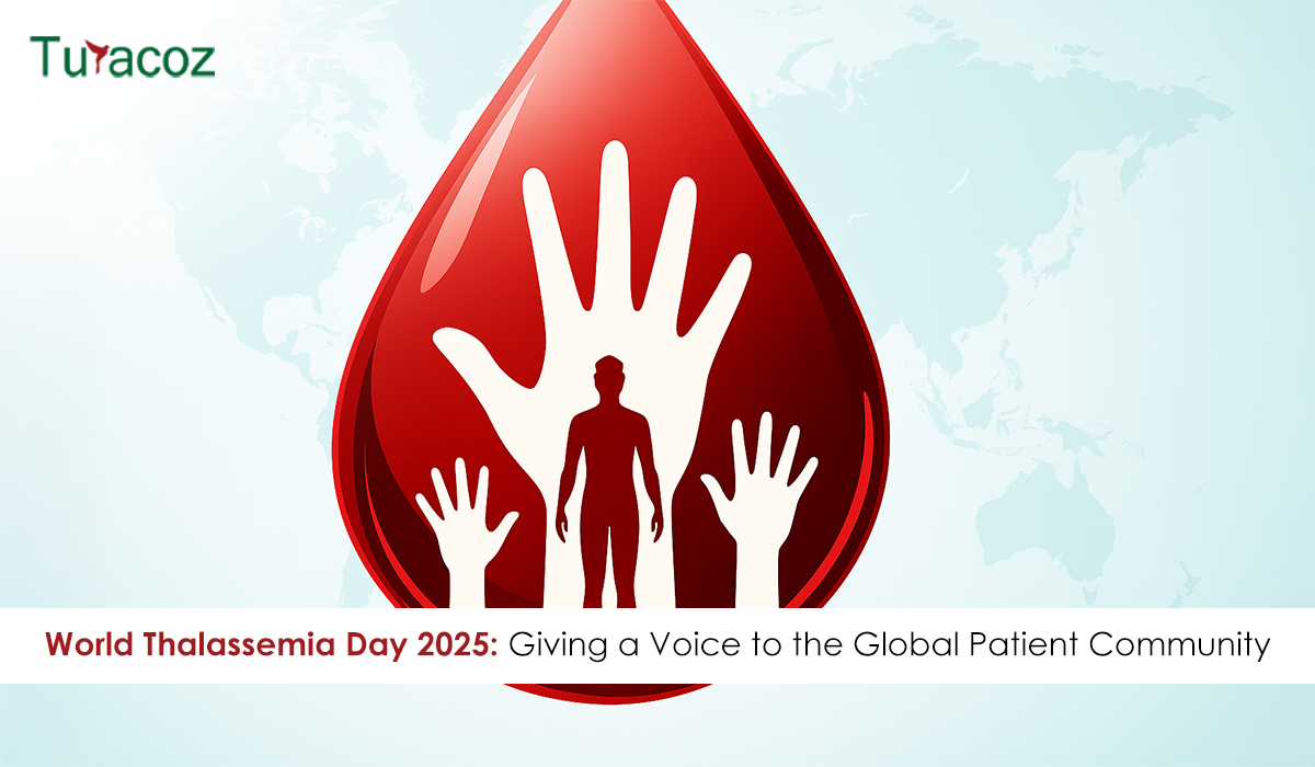
Every 8 May, World Thalassemia Day shines an international spotlight on the millions of people living with this inherited genetic disorder.
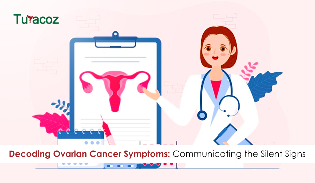
Ovarian cancer remains one of the most challenging gynaecologic malignancies, often referred to as a “silent killer” due to its subtle onset and late-stage diagnosis.1 In 2022, 324,603 women worldwide were diagnosed with ovarian cancer.

The healthcare landscape is being reshaped at an unprecedented pace, powered by sophisticated data analytics, emerging technologies, and the escalating

Biosimilars—biologic medicines that are highly similar to FDA-approved originator biologics—offer a cost-effective alternative without compromising clinical efficacy.1,2 Since the first
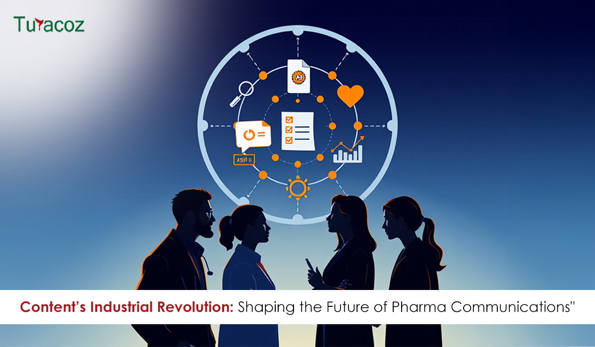
Communications In a rapidly evolving digital ecosystem, the pharmaceutical industry’s relationship with content is undergoing a seismic shift. At the
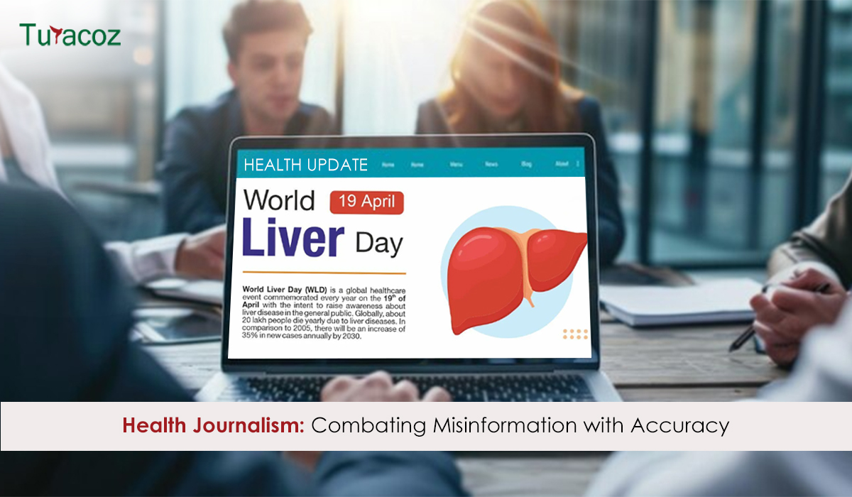
By Turacoz Healthcare Solutions | World Liver Day 2025 In a world where social media dominates wellness discussions, liver health
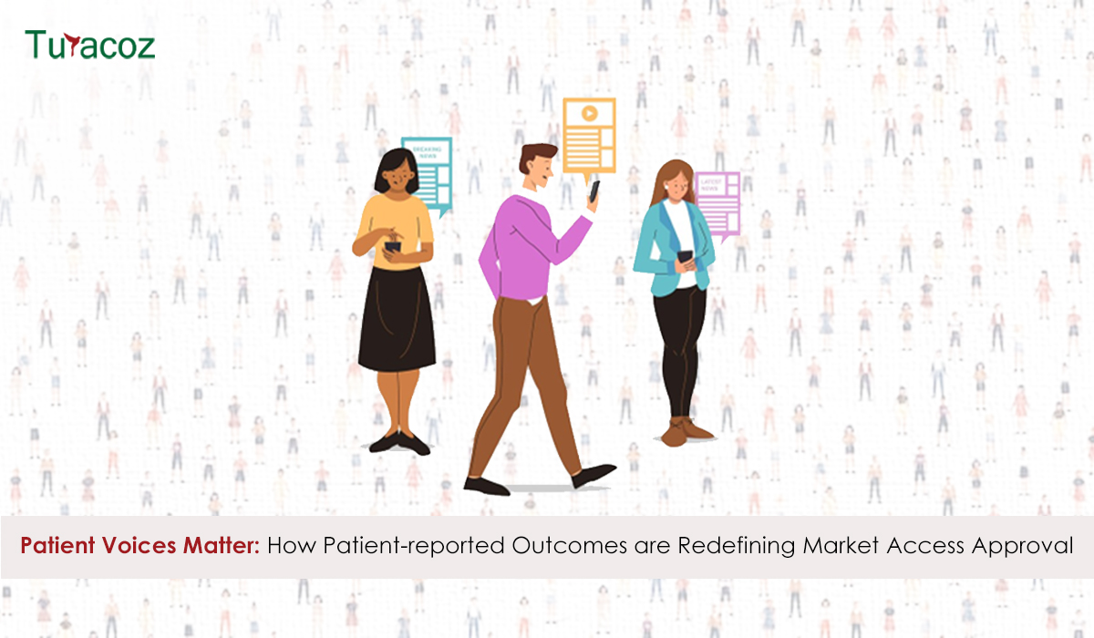
The healthcare industry is experiencing a paradigm shift as patient voices take center stage in drug development and approval processes.

In the evolving era of healthcare, data is the foundation of informed decision-making. With the rise of Artificial Intelligence (AI)

In an era where healthcare decisions are increasingly driven by data, real-world evidence (RWE) has become a crucial tool for

Colorectal cancer (CRC) is the third most commonly diagnosed form of cancer globally and is the second most common cancer-related

Real-world evidence (RWE) has emerged as a critical complement to randomized clinical trials (RCTs) in healthcare regulatory decision-making. While RCTs

Healthcare is a constantly evolving field, where innovation, research, and technology shape patient care and outcomes. Ongoing education isn’t just
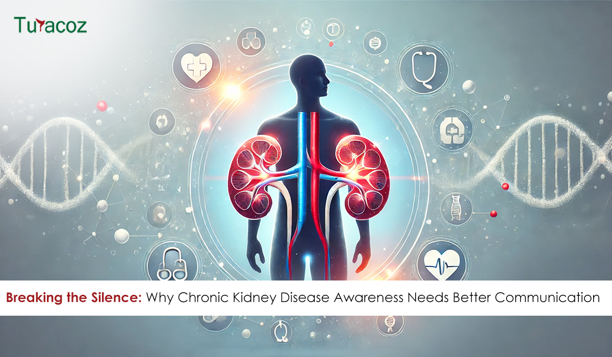
Chronic kidney disease (CKD) is often called ‘silent killer’ as most people live with it for years without symptoms. In
Imagine a world where every woman has the power to make decisions about her health, future, and family’s well-being. A
Recently, while working on a project about preeclampsia during pregnancy, our team was startled to learn that preeclampsia is one

The pharmaceutical industry is undergoing a significant transformation. In the past, the focus was primarily on research, development, and approval
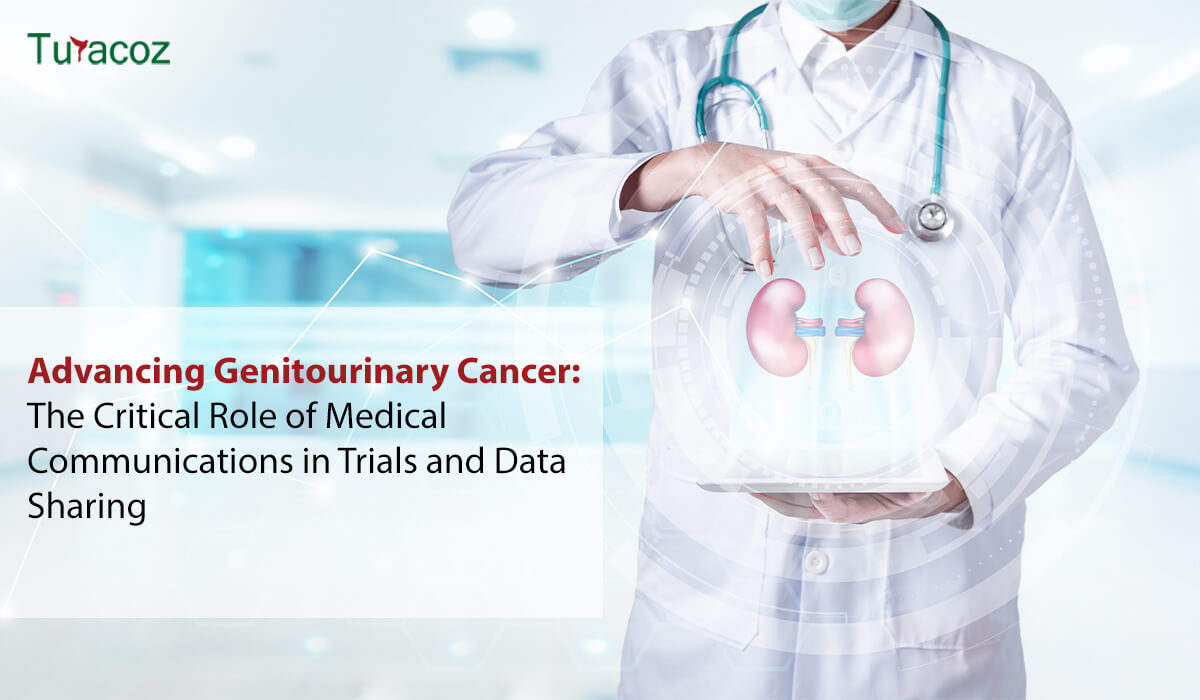
Introduction to Genitourinary Cancer Treatment Genitourinary (GU) cancers—including prostate, bladder, kidney, and testicular cancers—represent a significant proportion of global cancer

Medical writing demands utmost precision, as even a small error, such as a misplaced comma, can lead to confusion. While

In an extremely competitive market, it is a fact that many therapeutic products, medical devices, and clinical studies are never
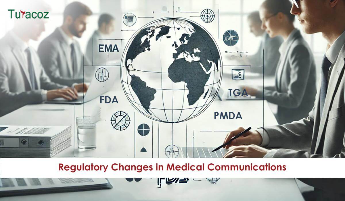
Regulatory Changes in Medical Communications: Preparing for 2025 and Beyond The pharmaceutical industry isn’t just about business—it’s about saving lives.
Medical writing involves the expertise to craft the healthcare content keeping in mind the audience you are catering to. This
Our recent poll revealed that Artificial intelligence (AI) integration is anticipated to have the most significant impact on the future
In the fast-evolving landscape of academic and medical publishing, journals and publication houses strive to stay relevant by providing comprehensive
Scientific advancement in academia depends greatly on research, but its true value lies in publishing and sharing findings with the
In scientific research, precision and clarity are essential for ensuring that valuable findings are accurately communicated to the global scientific
Academic societies have long been integral to the advancement of research, education, and professional development in various fields. In the
The landscape of scientific publishing is transforming, driven by advances in technology, changes in business models, and the evolving needs

In the evolving medical research field, identifying unexplored areas and novel opportunities is crucial for advancing scientific knowledge and improving
Are you finding it challenging to make your medical communications clear and engaging? Navigating the world of medical content can
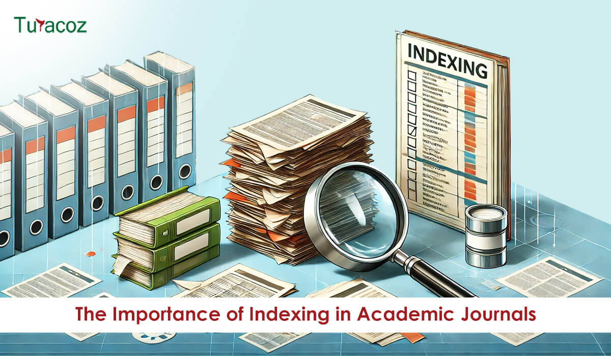
In the rapidly evolving academic publishing world, journal indexing plays a pivotal role in determining the visibility, accessibility, and credibility

Medical writing is an exciting and rapidly growing field that blends the expertise of healthcare professionals with the creativity of
In the field of medical publishing, accuracy and precision are crucial. Medical writers and editors ensure accuracy, clarity, consistency, and

The journey from completing a research project to seeing your work published in a reputable journal can be daunting. The

Academic publishing is undergoing a significant transformation, driven by technological advancements, changing attitudes toward knowledge dissemination, and the need for
In the rapidly evolving field of medical research, the application of artificial intelligence (AI) has brought transformative changes. Among the
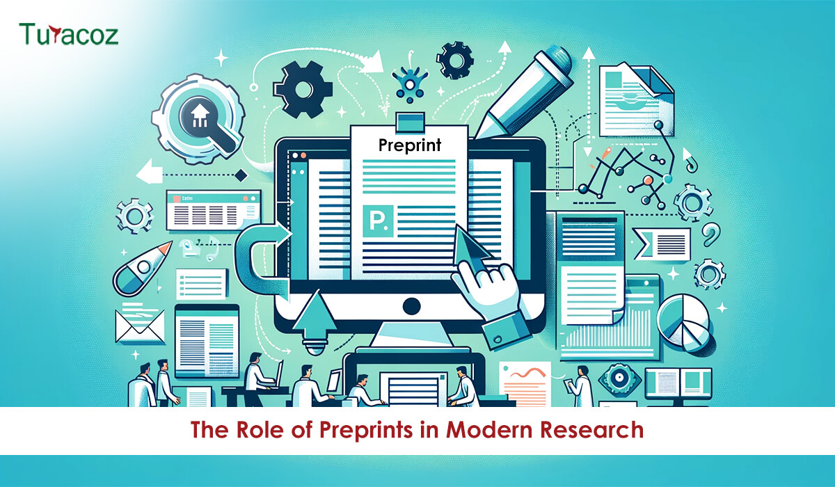
Scientific research dissemination has undergone a significant transformation in recent years, largely owing to the rise of preprint repositories. Preprints,
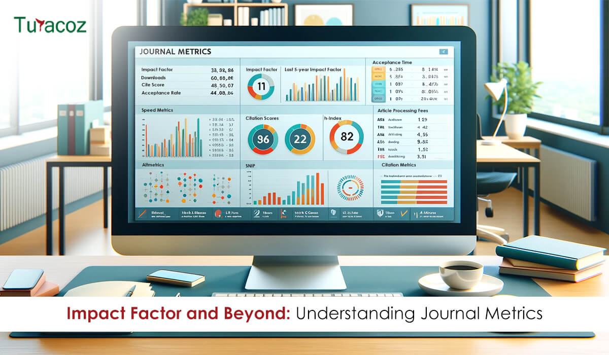
Journal metrics play a crucial role in evaluating the significance and influence of scholarly journals in academic publishing. These metrics

Artificial Intelligence (AI) and Machine Learning (ML) are revolutionizing various sectors, peer review in academic publishing is no exception. The
Scientific publishing is a cornerstone of academic and research progress that involves presenting the latest discoveries, fostering collaboration, and driving

The peer review process is a cornerstone of academic and scientific publishing. It serves as a quality control mechanism to
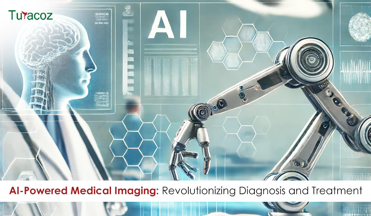
Artificial Intelligence (AI) is rapidly transforming the healthcare industry, and medical imaging is at the forefront of this revolution. The
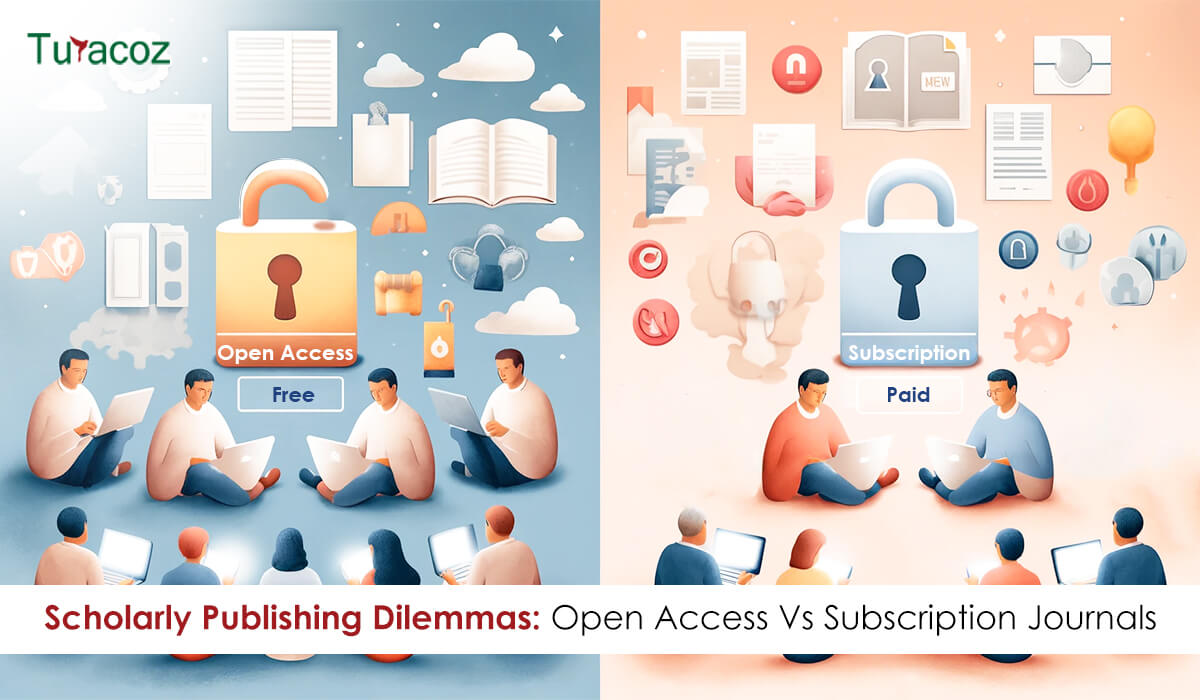
In the rapidly changing domain of academic publishing, two distinct models have emerged as prominent pathways for disseminating research findings:
In the dynamic world of academia and medical research, effectively communicating your findings through well-designed presentations that captivate the audience

In the dynamic field of medical communication, managing a content lab effectively is crucial to ensure the delivery of high-quality
For centuries, the world of academic publishing was dominated by the printed word. Scholarly journals, monographs, and textbooks were carefully

Proofreading is the meticulous review of written content which is the final stage in the writing process. It is an
Publishing research is a significant achievement in an academic or scientific journey. It not only adds to the global knowledge

The European Medicines Agency (EMA) has released a question-and-answer guidance on the implementation of Regulations (EU) 2017/745 and (EU) 2017/746
Artificial Intelligence (AI) has already begun to revolutionize numerous industries, and medical affairs is no exception. As the technology continues
In healthcare, staying up-to-date with the latest research, guidelines, and clinical studies is crucial for medical professionals. However, the sheer

Pharmaceutical companies frequently co-package European Conformity (CE) marked medical devices with their medicinal products for patient convenience. In such instances,
In the rapidly evolving landscape of healthcare and scientific research, effective communication is crucial. Medical writing, which encompasses a broad
In today’s fast-paced and ever-evolving healthcare landscape, effective communication is paramount. Medical services, including medical affairs and marketing departments, face

Whether you are an aspiring medical writer looking to kickstart your career or an experienced professional aiming to stay ahead
Integrating artificial intelligence (AI) into medical communication can streamline processes, enhance efficiency, and improve patient outcomes. Given how AI is

In the realm of medical communications, the ability to deliver information in an engaging and accessible manner is paramount. As

Regulatory medical writing is a specialized field that involves developing and managing documentation necessary to obtain regulatory approval for medical

Regulatory writing, a crucial skill in various industries, can be enhanced through training programs. These programs are designed to navigate

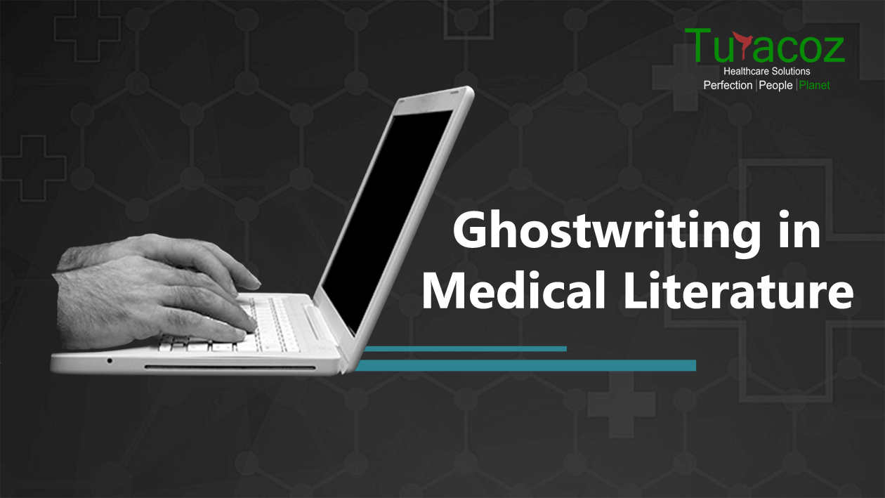
In the world of medical and scientific publishing, ghost-writing has long been a common practice. Researchers, doctors, and subject matter

In the intricate realm of medical communications, precision and clarity are paramount. Every piece of content, be it a research
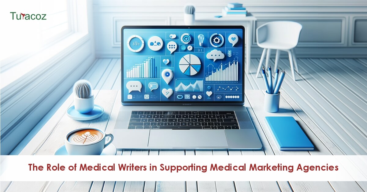
Medical marketing agencies play a crucial role in the healthcare industry by providing specialized marketing services tailored to the unique

In today’s fast-paced world, PowerPoint presentations have become indispensable tools for effective communication. Whether you’re a student presenting a project,
Medical writing is a specialized discipline within the clinical research domain, focused on preparing scientific documents. These documents must adhere

The complexity of research and the pressure to publish in prestigious journals can feel daunting, tedious, and frustratingly slow. This

The evolving landscape of healthcare and pharmaceutical industries has catalysed a significant transformation in the traditional role of medical writers.
In the realm of healthcare, the demand for proficient medical writers in scientific and medical communications is soaring. Whether it’s
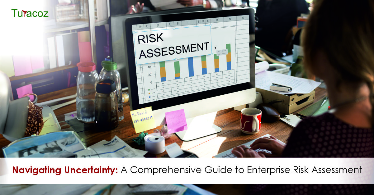
In latest fast-paced and dynamic enterprise environment, corporations face a myriad of risks which can notably impact their operations, reputation,
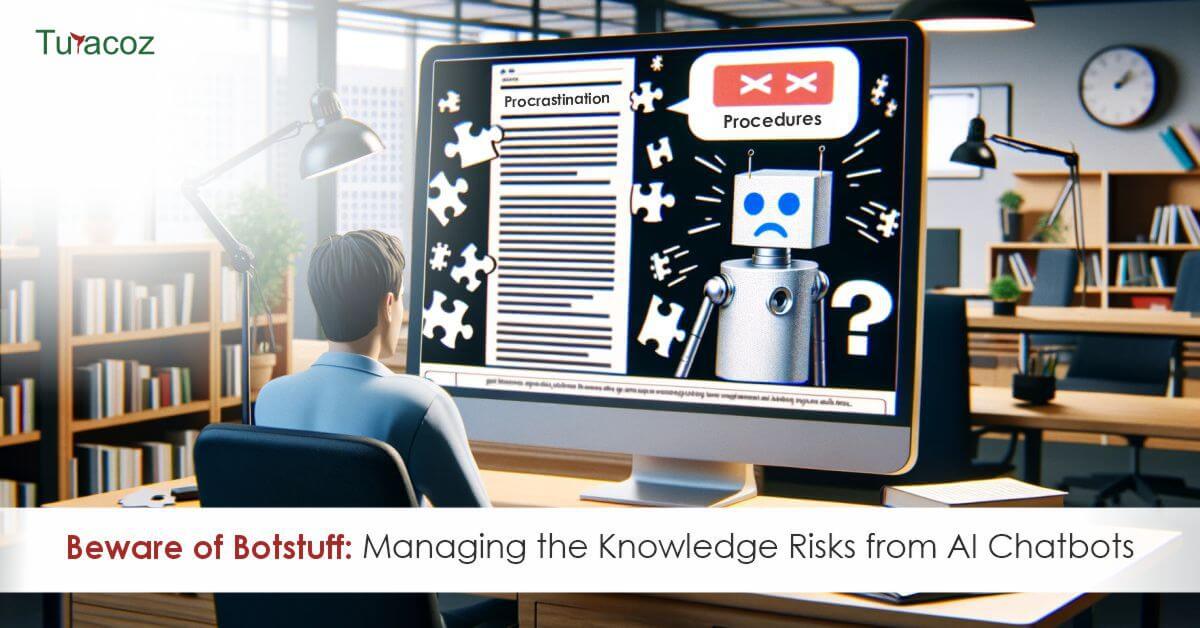
In the digital era, AI-driven chatbots have become ubiquitous, transforming how we interact with information and automate processes across various
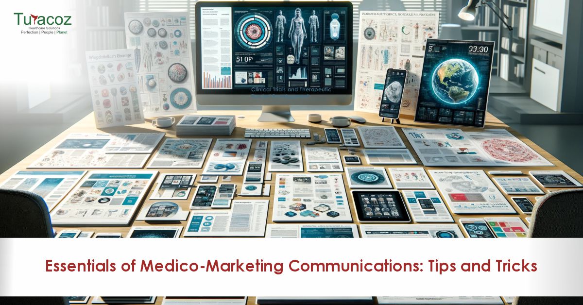
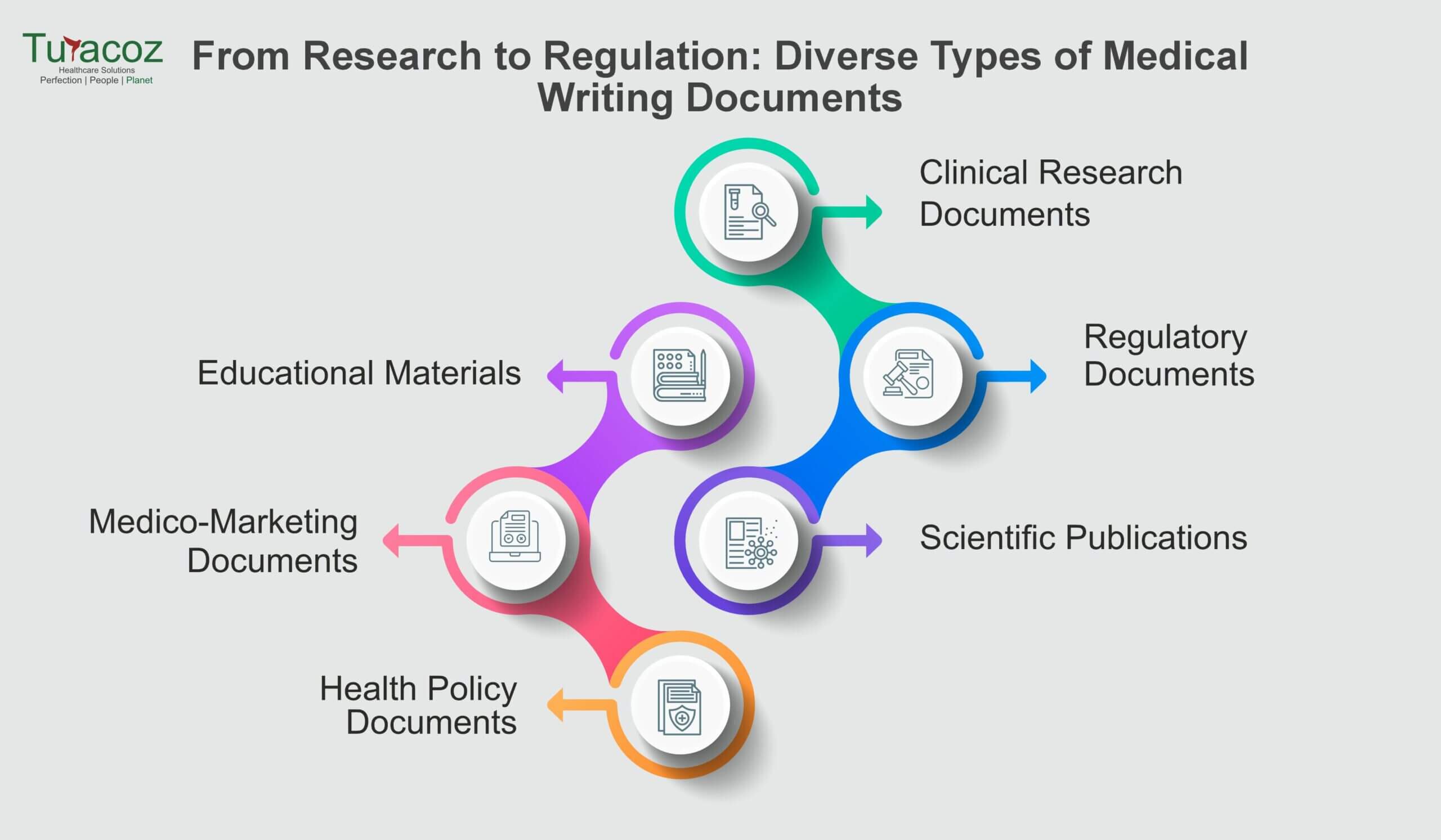
Medico-marketing documents play a crucial role in healthcare marketing by connecting the gap between clinical innovations and their practical applications
The healthcare industry constantly evolves, with new treatments, technologies, and regulations emerging every year. As a medical writer, staying up-to-date on these changes and maintaining a

In the digital age, where the internet serves as a primary source of information, medical writers face a dual challenge:
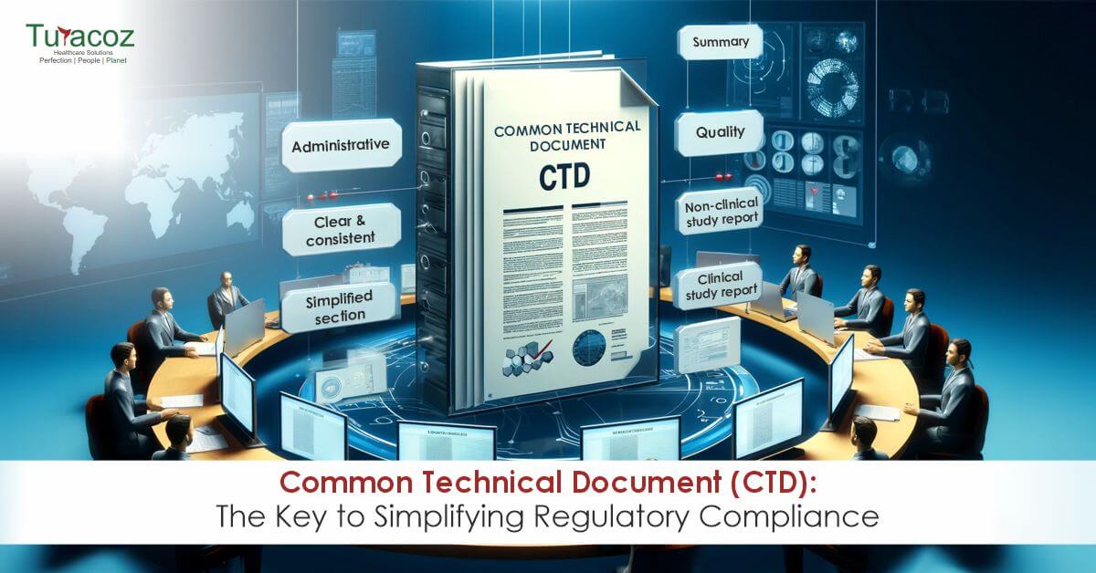
Before the introduction of the Common Technical Document (CTD) in 2002, each major regulatory region, including the European Union (EU),

In the world of scientific research and communication, it is crucial to convey complex information clearly and effectively. Visual elements

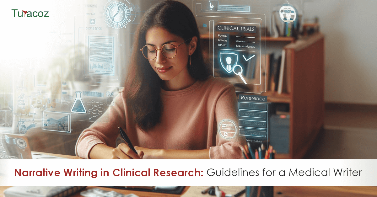
In clinical research, documenting results and findings is as important as conducting the study. The Clinical Study Report (CSR) is
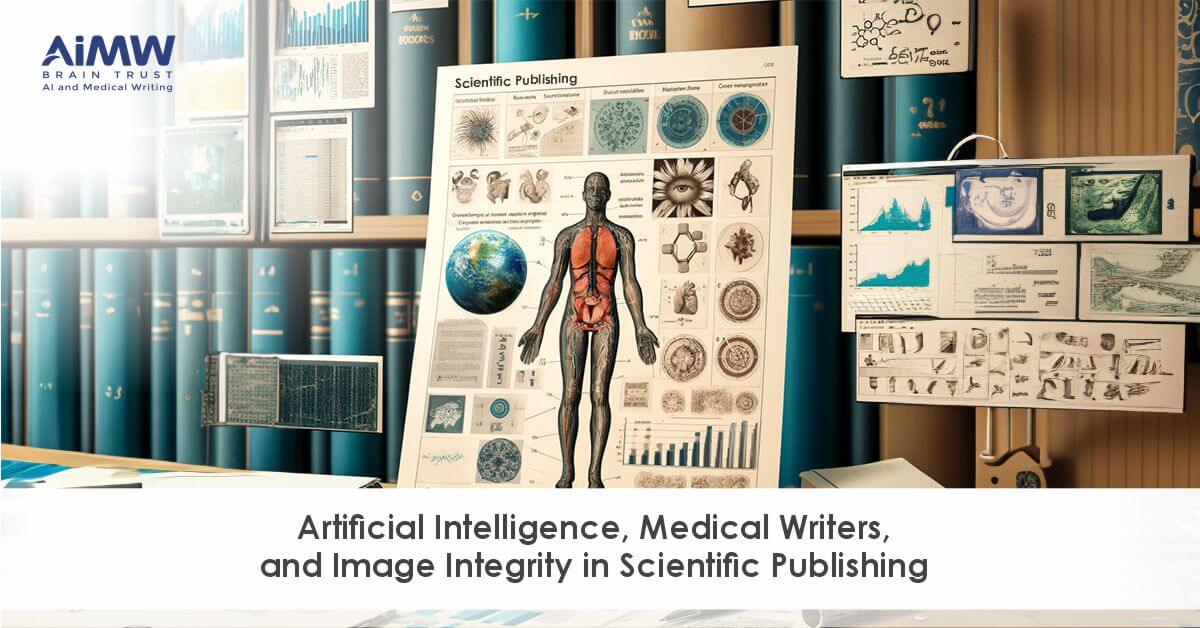
In scientific publishing, the accuracy and integrity of visual data are as crucial as the written word. At Turacoz, we
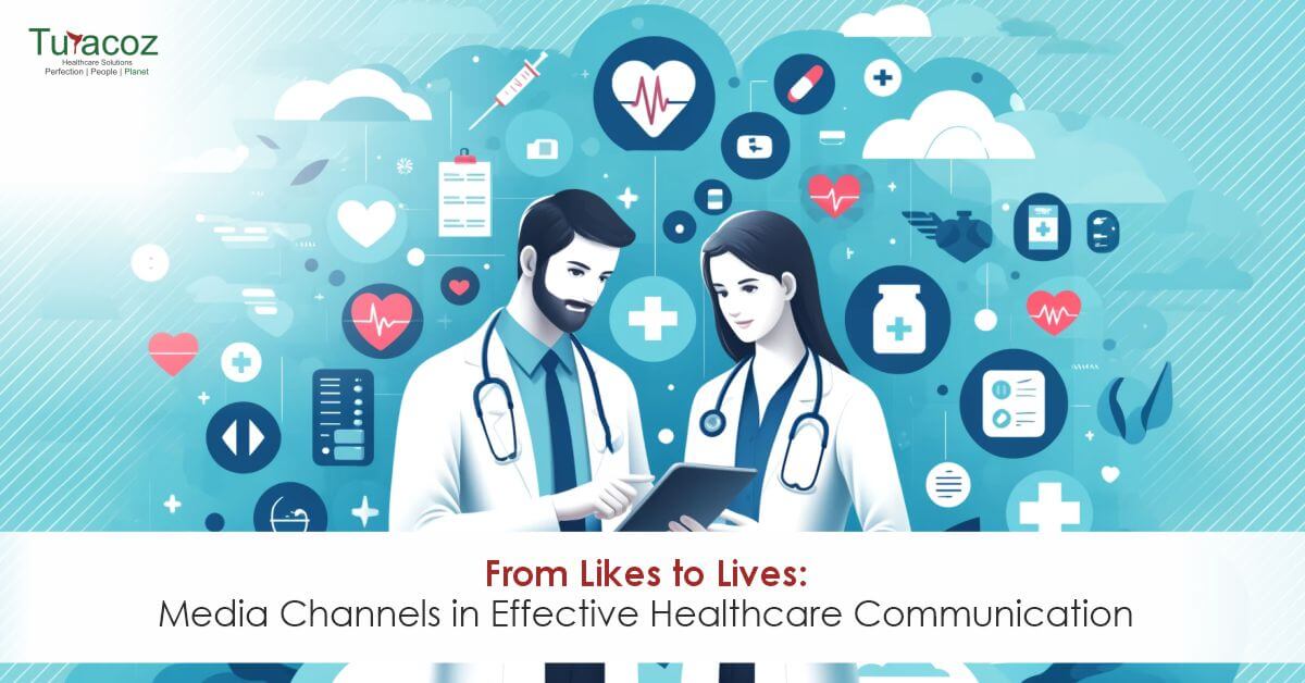
In health and medical communication, understanding how to leverage media channels (earned, owned, and social) effectively can significantly enhance a
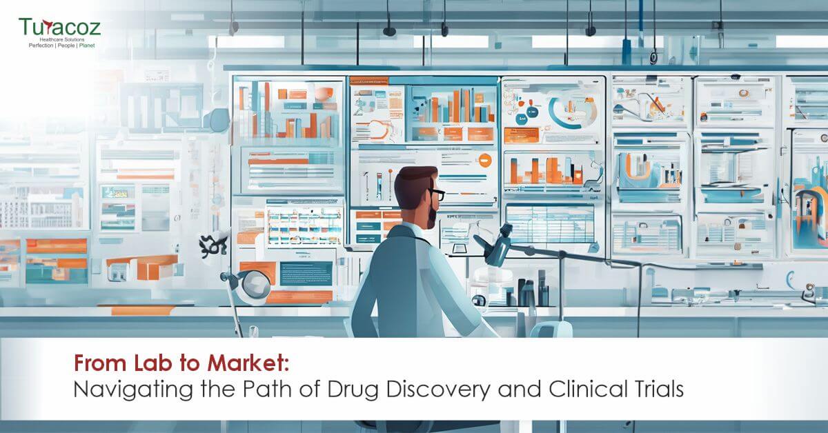
Developing new drugs and medical treatments is a testament to the relentless pursuit of innovation and improving human health through
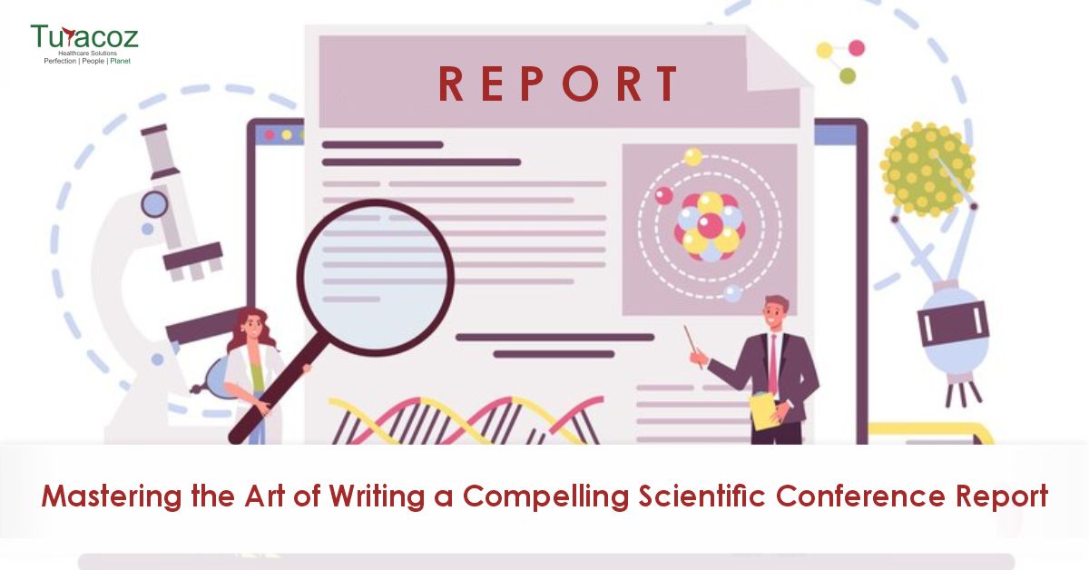
Scientific conferences stand as vibrant hubs of knowledge exchange, where the latest discoveries are unveiled, ideas are challenged, and collaborations

In the ever-evolving landscape of cybersecurity, regularly updating software and applying security patches is a fundamental practice for safeguarding your

The fusion of Artificial Intelligence (AI) with medical writing signifies a groundbreaking shift in the domain of scientific literature, marking
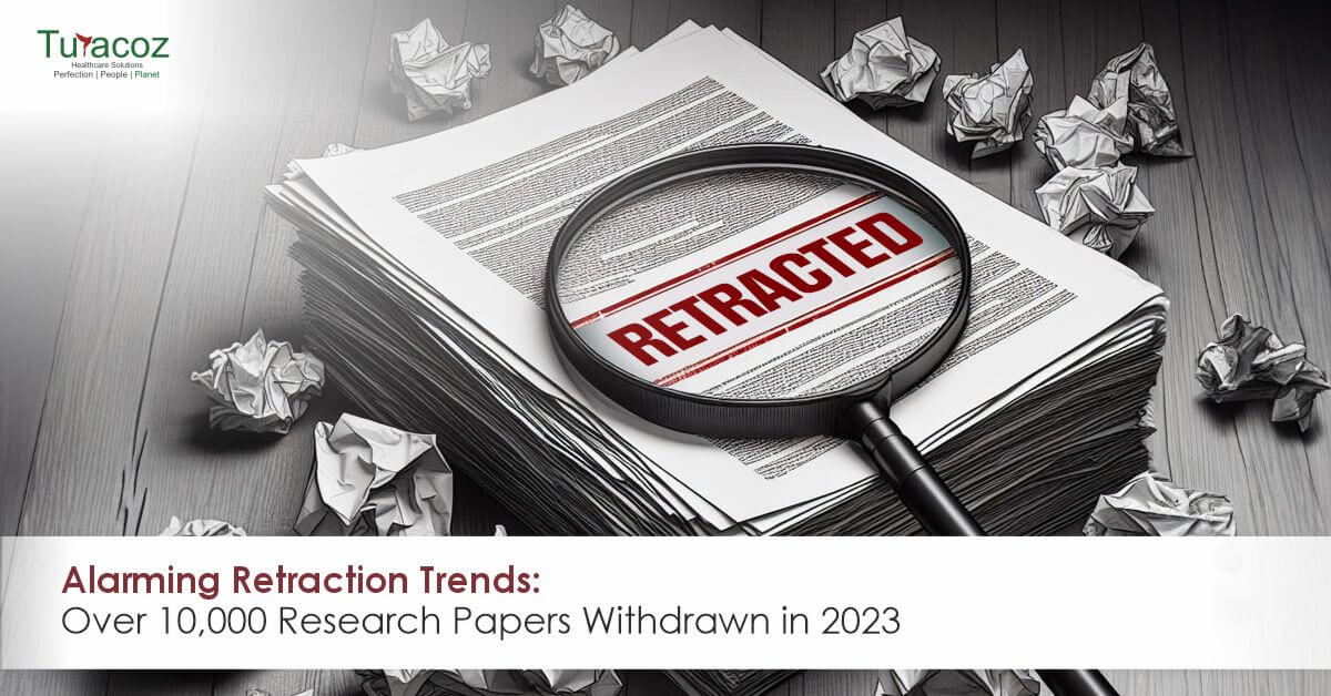
The academic publishing industry, medical and scientific communication services have been hit with the dark reality of the humongous number

In the intricate world of medical research and publication, the journey from discovery to global dissemination is both vital and
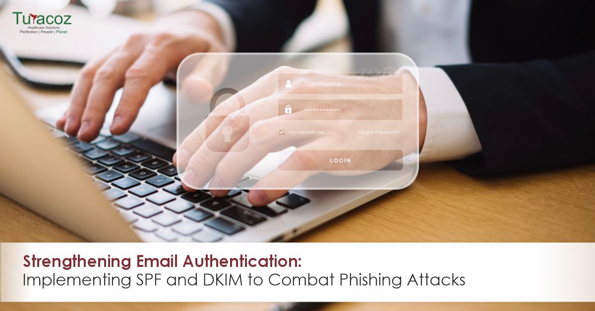
Email authentication plays a crucial role in safeguarding your company from phishing attacks. Sender Policy Framework (SPF) and DomainKeys Identified
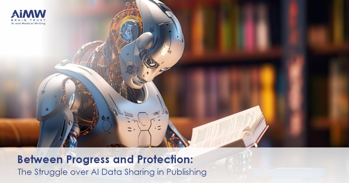
The emergence of Artificial Intelligence (AI), particularly generative AI, has sent shockwaves through various sectors including academia. While some have

In the fast-paced world of medical communication, where accuracy and clarity are paramount, manuscript editing stands as a cornerstone of

Email remains one of the primary communication channels for businesses, but it also serves as a common avenue for cybercriminals
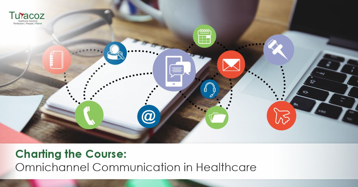
The landscape of information sharing has seen a remarkable evolution. The shift towards omnichannel communication is a game-changer, promising to
In a recent study published by the Journal of Librarianship and Scholarly Communication, researchers have unveiled a stark reality that
In today’s digital landscape, protecting sensitive data and systems from unauthorized access is of paramount importance. Cyberattacks, including phishing attempts,

In a recent and unprecedented event, the esteemed open-access journal, Frontiers in Cell and Developmental Biology, found itself at the
Medical writers find themselves at a critical juncture in the scientific and medical communications field. The rise of predatory journals

In today’s digital age, where cyber threats are on the rise, organizations face an ever-present danger in the form of

In healthcare and medicine, the precision and clarity of information can significantly impact patient outcomes and public health. This is

Healthcare research (Medical Research) and development is dynamic and staying abreast with the latest scientific discoveries is imperative to remain
Science often appears as a maze filled with complex terminologies and heaps of data that can be challenging to navigate.

In our interconnected and globalized world, phishing attacks via email have become an important threat to companies of all sizes.
In medical communications, the traditional reliance on text-heavy documents is undergoing a transformative shift. The rising surge of audiovisual (AV)

The introduction of the ACCORD (ACcurate COnsensus Reporting Document) guidelines marks a pivotal advancement in consensus-based research within biomedicine. These
Medical writing plays a pivotal role in conveying medical information and research findings, addressing diverse needs within the healthcare and

Medical writing serves as a crucial link in enhancing patient engagement, providing a vital channel through which healthcare providers communicate

ou cannot share a single post on social media without acknowledging its original creator. This is exactly how a citation works! Citations are a way to inform people about the source of the information while giving credit to the researchers. If we want to transport science from a journal to a layman, citations are the means for travelling.

“Content is the king”, they say. Keywords are the powerful weapons of your king. Words or phrases which represent your ideas or define the content in a manuscript are known as keywords. These act as context-specific probes helping researchers to find your manuscript better. The specific words that a researcher will write while looking through search engines, journals, indexing, etc.
Visualization of data and information makes clinical research and science more realistic and accessible. A visual presentation of data has

Working within organized cabins, reporting to managers, and clocking in as per company norms: work culture has taken a leap beyond these precincts. “Opportunities are created by us”, as the saying goes. Freelance Medical Writing exemplifies this precisely. Undoubtedly, full-time jobs support a sense of structure, decorum and a running income, but they are not always conducive, especially for those who are unable to devote time to a nine-to-six job due to personal commitments. This is precisely where freelancing comes to rescue.
Medico marketing and medical communications are adding a novel approach to the dissemination of information by medical and healthcare industry.

How to know if an article or a journal is trustworthy source? Literature search forms the basic unit of trust
rs chosen by our healthcare workers. Nurses are the lifeline of our healthcare system. On duty, come rain or sunshine. A day without nurses in hospitals cannot be dreamt of because it is impossible and catastrophic.
Ideas and knowledge will be of no value if not transferred and communicated with the right words and some creativity. If you do not want blank faces staring back at you, it is important to put your message simply and innovatively. Presentations are a powerful way of unveiling valuable information, scientific research, training peers, etc. and keeping the audience engaged at the same time. But what makes a scientific presentation weight heavier than any other? The value of a well-designed presentation is neglected in the medical world.

You will not ring the bell of a home where you are welcomed without a smile. This is the simplest description of client servicing. Be it a street eatery or a multinational company, they are running fundamentally on two core aspects: Quality and Service.
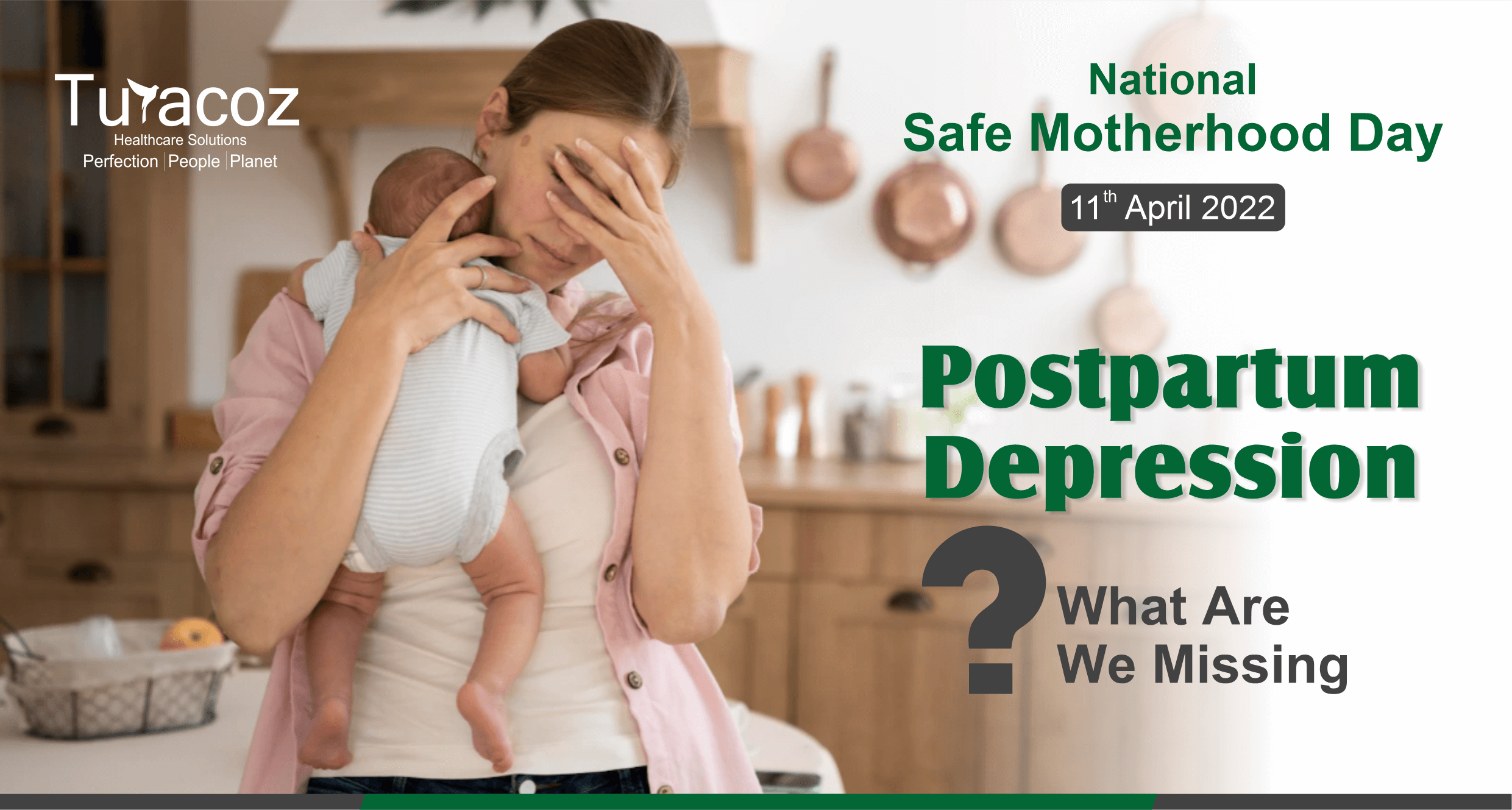
Holding the baby for long hours, cleaning poop with a smile on face, singing lullabies relentlessly, spending sleepless nights are the most common scenes of new motherhood. But what is not seen are the collateral surges of emotional drain-outs, restlessness, insomnia, anxiety, panic, bouts of despondency and detachment. While the former is normal, the latter is compelled to be normalized.

Digitalization has recalibrated healthcare to new heights. It is imperative for healthcare professionals and medical students to stay abreast with scientific and clinical advancements, but ironically the rush hours of duty leave them very little room and time for it. Nevertheless, newer technological options have widened the windows to healthcare communications and one such innovation is the emergence of Podcasts.

Fingers constantly working on laptops, eyes lost in the starlight of the screen, and mind battling
with anger, fear, anxiety, judgments, and pressure to win the race! This is the image of a modern
human working to earn a little more and finding peace a little less. The struggle of the mind
against the world has led to an increase in mental health issues.

As it brings forth equally-chances and struggles, opportunities, and failures, wishes and disappointments, it becomes imperative to choose our area of focus, wisely.
From the corridors of laboratories, science has found its way to our mobile screens. Digital media and social apps have pulverized the boundaries between a published paper and the public. Today a scientist can communicate and share his progress with everyone on the planet irrespective of his background. During the pandemic, Twitter brought an evolution in the minds of people about research and science.

“What is the side effect of paracetamol? Why can’t my kid get vaccinated? Which vaccine is more effective?” The patients and worried parents were looking all over on internet to treasure trove the answers to these questions. In such a scenario and many of its likes, Google becomes the go-to database for information, but it, unfortunately, lead to misinformation, misdiagnosis, spurious remedies, all heading to graver damage to health.

Needles, pills, liquid diets, and a room with the daunting odor of disease, are things a cancer patient is never devoid of experiencing. Cancer is a disease that takes a human down physically and mentally; a disease in which your own body cells refuse to listen to you. This metastasizing monster has its claws all over the globe and the entire healthcare community is leaving no stones unturned to find that perfect cure.

“We are sorry to inform you that your submission is rejected”- This is something you never want to hear or read but this is most often experienced. These words are disheartening. When we start research, it becomes a dream to see that work turning into pages of a journal.
She was unfamiliar with the bacteria inside her and hence even after taking Multi-Drug- Therapy she didn’t eat or sleep with her children for more than four years. The universe might be testing her as she lost her husband during this span of her life. She was denied her rights towards her husband’s estate.

Introduction to Medical Writing Medical writing involves producing clear, precise documents of high quality to effectively communicate scientific, medical, and

In recent times, Breast Cancer has been one of the predominant cancers. How predominant? Let’s have a look at the numbers. A total of 7.8 million women were diagnosed worldwide within the 5-year period according to the WHO (World Health Organization) statistics reported at the end of 2020.
What is artificial intelligence (AI)? As per the Merriam Webster dictionary, AI is “the capability of a machine to imitate
feeds. However, have you ever questioned yourself why there is a sudden surge in opting for these diets? Where did we all go wrong in making diet choices? Are these diets necessary for everyone? The answer is NO.
Polycystic Ovary Syndrome (PCOS), also known as Polycystic Ovarian Disease (PCOD) is one of common hormonal syndrome that women blame for their weight gain. The cause of PCOS is still unknown, but studies have shown that it may involve a combination of genetic and environmental factors (like lifestyle, pollution).

According to the US Food and Drug Administration (FDA), a ‘device recall’ is defined as, “when a manufacturer takes a correction or removal action to address an issue with the medical device that violates the FDA law”1.

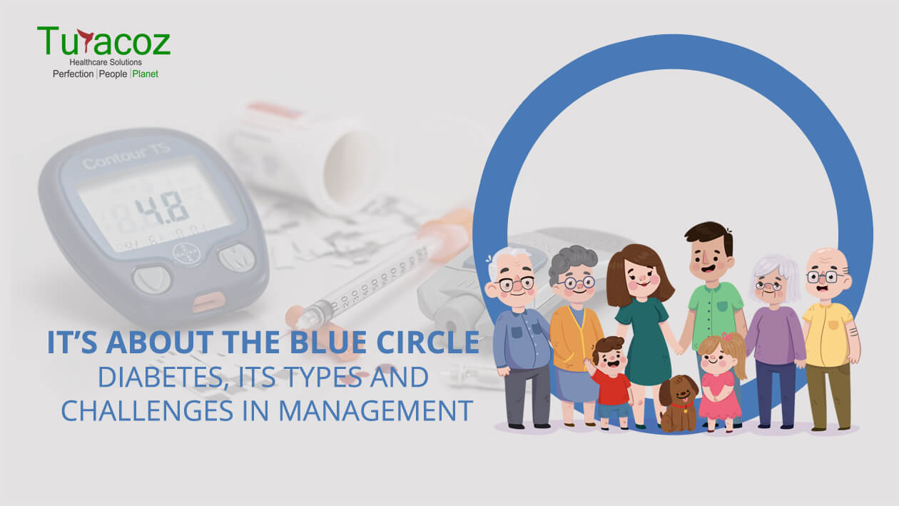
Diabetes Mellitus (DM) is an endocrine metabolic disorder, characterized by elevated blood glucose level. DM is sub-classified into following categories.
Coronavirus disease 2019(COVID-19) is giving the world a rollercoaster ride with shoot-up in infection cases globally. With more than 14 crores of infection cases worldwide in 16 months, the world is looking up to a miracle to stop this pandemic. One way of controlling the spread is to get vaccinated. More than 98 crores vaccines have been administered globally till the end of April 2021 and it is still making way to reach people in every corner of the world. India is in its second wave of COVID-19 infection with a tremendous rise in corona infection cases compared to the first wave of infection. But a positive side of this is, the largest vaccination drive of the world is under progress in India and giving positive hope for Indians to overcome this situation.
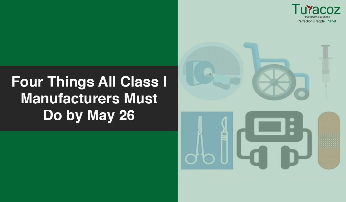
Class I devices are the lowest risk medical devices. However, the manufacturers of these devices also need to act immediately to comply with the new European Union (EU) Medical Devices Regulation (MDR); otherwise, they risk being unable to place their devices on the EU market after May 26, 2021.

Sleep is an important part of our day-to-day life and everybody long for a good night’s sleep after a day’s work. But do you know why you sleep at night and are awake during daytime? Do you know we have a biological clock inside us? Do you know why some people fall asleep while talking or even while driving? If you want to know the answers to these questions, please read on.

What is pain? Pain can be a displeasing and uncomfortable experience associated with possible damage to the body. The word

Working from home comes with its own set of pros and cons. And staying fit while working from home is
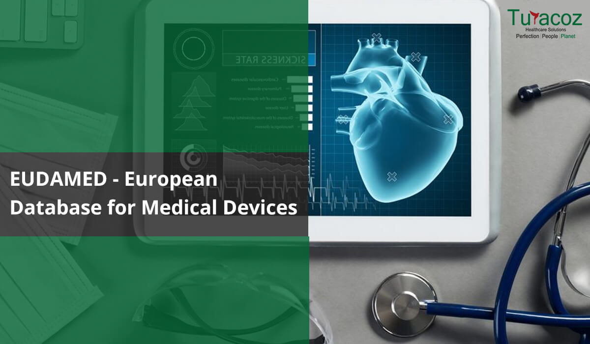
Background According to European Commission a web-based portal EUDAMED is being developed to implement Regulation (EU) 2017/745 on medical devices
As the Medical Device Regulation (MDR) deadlines are approaching for re-certification and/or introduction of new products, manufacturers are also working

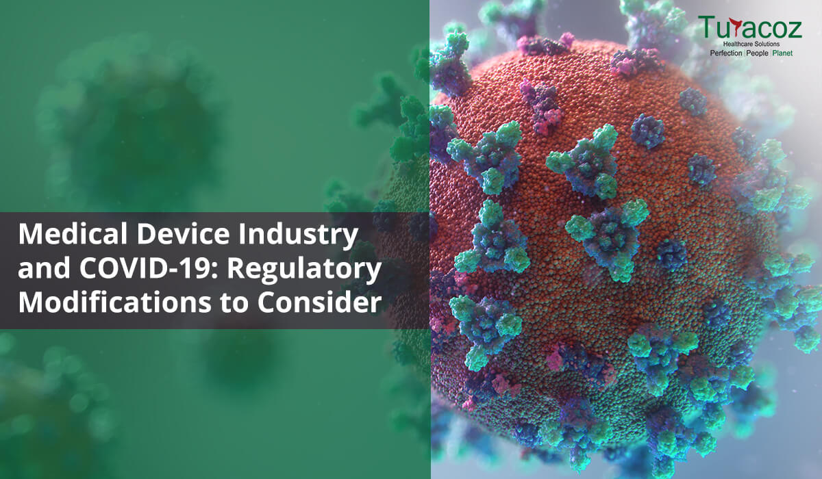
The COVID-19 pandemic has overwhelmed our healthcare delivery systems and has effected the delivery of medical care across the spectrum. Medical device companies have also been hit by the crisis
as they struggle to make decisions regarding supply chains, and regulatory obligations in the midst of uncertainty.
Please find our blog discussing the impact of the pandemic on medical device regulations.

Background Writing is a medium of human communication to express one’s thinking in easily understandable but effective way. The strength

It has been weeks and months since we have stopped counting days being in this pandemic-driven lockdown. There is a unique quality to this day-by-day pandemic despair; this quarantine depression is edging humans into physical and mental stagnation. According to an article I read in the Hindu couple of days back, approximately 12.2 crore Indians lost their jobs during the coronavirus lockdown in April 2020 only, which makes COVID 19 pandemic much more stressful for people.
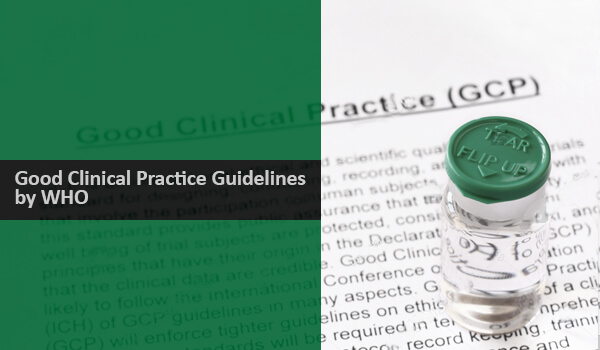
Good Clinical Research Practice (GCP) is an established international ethical and scientific quality standard process for the design, conduct, performance,
Medicine is an ever-changing science. As new researches and clinical experience broaden our knowledge, changes in treatment, and drug therapy
Cancer refers to a medical condition characterized by uncontrolled division of cells forming tumor. During normal cell cycle, the cells grow, divide and die and new cells take their place, whereas in cancer, the abnormal cells continue dividing and do not die.
The gift of blood is the gift of life. There is no other substitute for human blood. According to statistics, every two seconds someone is in dire need for blood. And only one pint of blood can save up to three lives. Data collected over a span of many years suggests that the blood type most often requested by hospitals is Type O.
The world’s leading public health challenge is the HIV virus that leads to AIDS. In 2018, around 37.9 million people were infected with HIV/AIDS and approximately 1.7 million more joined the club worldwide.
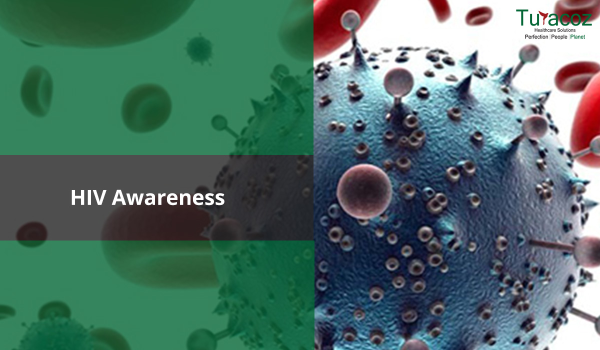
The human immunodeficiency virus (HIV) invades the immune system and damages the host’s defense system and causes it to weaken
The campaign “World Diabetes Day (WDD)” was launched in 1991 jointly by International Diabetes Federation (IDF) and the World Health
According to statistics by the WHO, “The number of people with diabetes has risen from 108 million in 1980 to

Disease management programs (DMPs) are defined as “structured treatment plans that aim to help people manage their chronic disease in
Breast cancer is a growing concern as it is reported to be the most common cancer in women worldwide. About
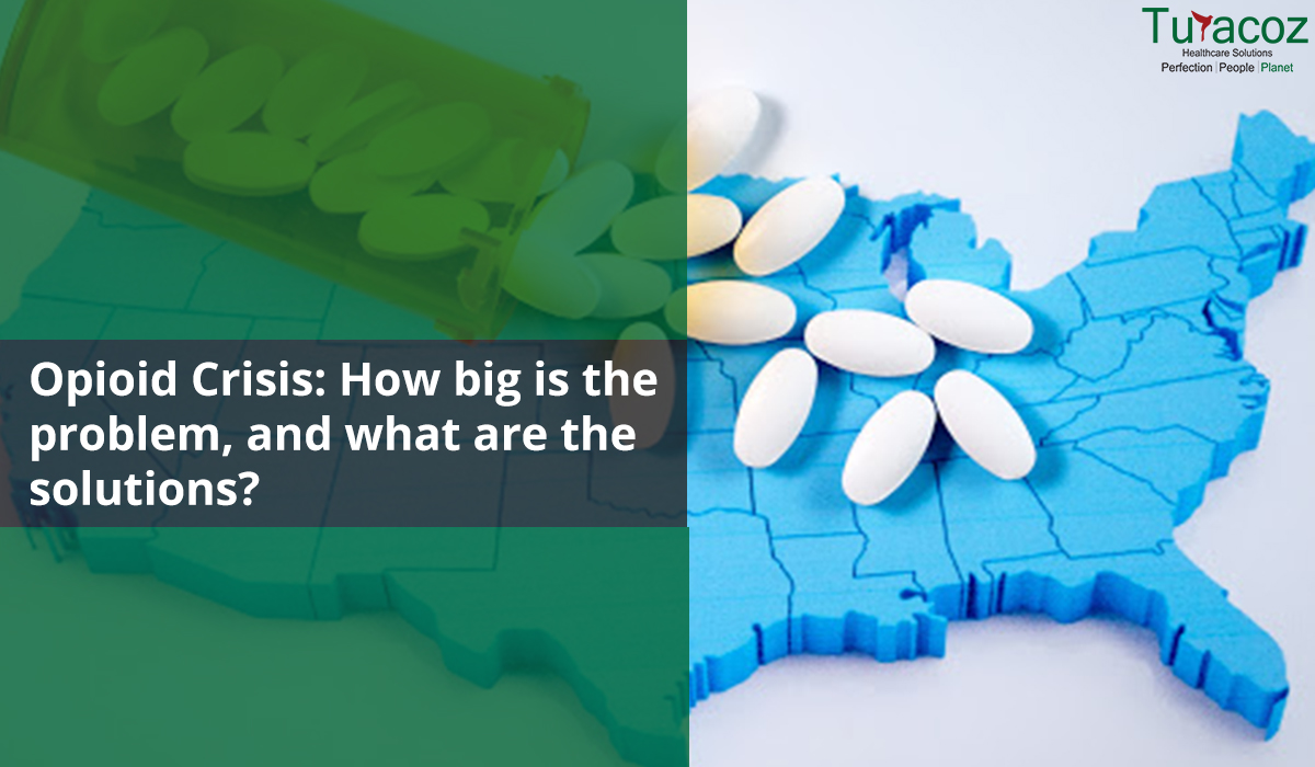
What are opioids? Opioids (Figure 1) are a class of drugs naturally found in the opium poppy plant that acts

Economic development of the people has improved their lifestyle. But the challenge that has arisen with this lifestyle change is
The term ‘pharmacovigilance’ was coined in the mid 70’s by a group of French pharmacologists and toxicologists to describe the

Introduction A biosimilar product, as defined by USFDA, is “a biological product that is highly similar to and has no

Peer Review is the process of evaluation of manuscripts submitted for scientific publication in journals/books, pre-clinical or clinical study reports,
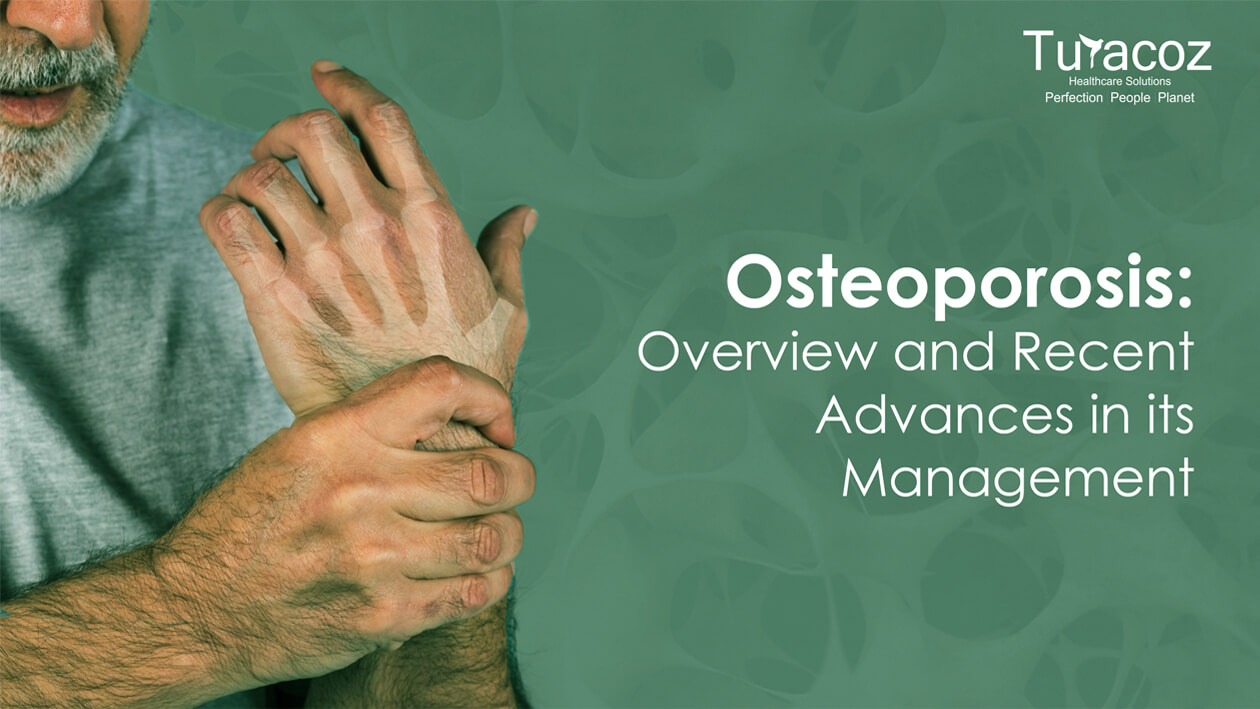
Osteoporosis is a silent age-related skeletal disease characterized by loss of bone mineral density and microarchitectural deterioration leading to increased
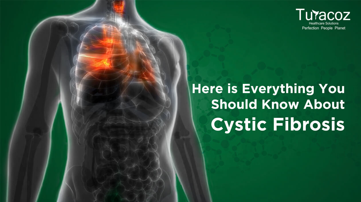
The month of May is commemorated as Cystic Fibrosis Awareness Month. It aims at raising awareness about cystic fibrosis (CF).

Most of us have possibly used it or sprinkled on our skin at some point in our life, ‘Talc’ which
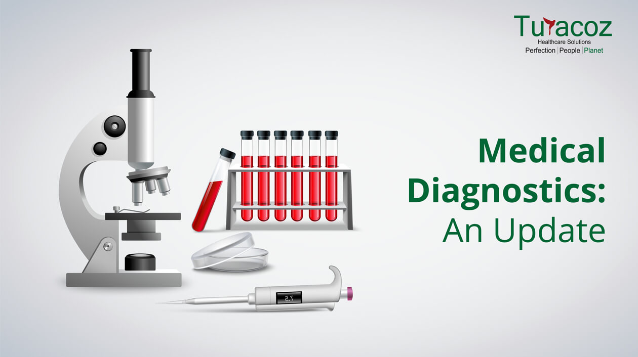
Diagnostics play a very important role in our everyday life, be it for a disease, condition or identification of a

The regulatory authorities have been on fire lately. They are vigilantly sniffing any suspicious and harmful substance in healthcare and

Effective from March 19, 2019, The New Drug and Clinical Trial Rules released by the Ministry of Health and Family

Women Innovation and Entrepreneurship Foundation (WIFE) had conducted the second edition of the National Leadership Summit on Women and Education
In the clinical trials industry, 80% of trials do not meet enrolment timelines, leading to a loss of $8

Introduction Financial disclosures enable the readers to evaluate the potential conflict of interest (COI) which probably builds the trust of
The global statistics for HIV/AIDS 2017 have revealed that around 37 million people across the globe were affected by HIV,
Ever since HIV/AIDS is discovered, there have been lots of rumors surrounding it. This article aims at busting those myths
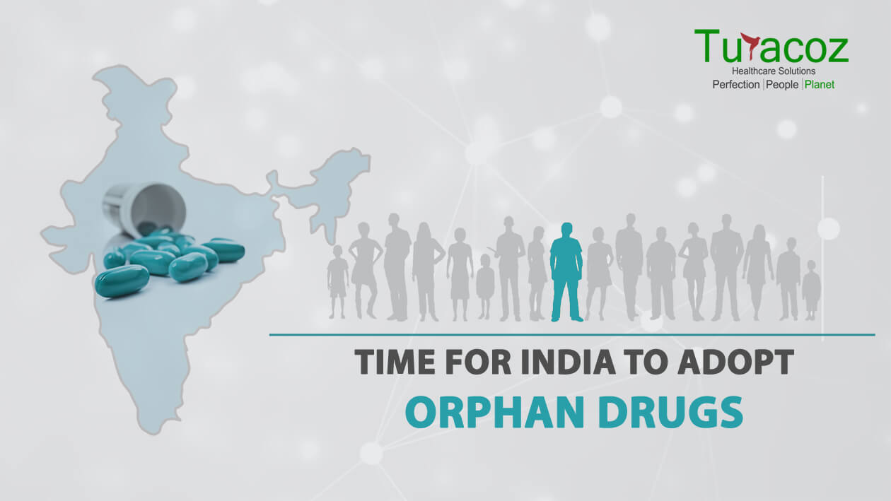
What are orphan drugs? The term orphan drug refers to any drug or biological product intended for treatment, prevention or
Not everything sugar is good for you! The overdose of sweetness in your life can be fatal as the threat
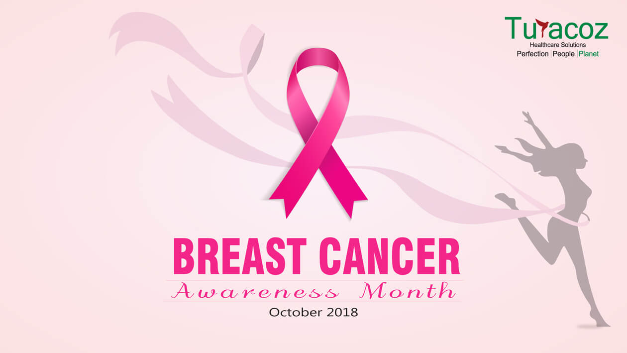
The month of October is dedicated to breast cancer to create awareness regarding this prevalent cancer in women, globally. Breast

Publication planning is that part of the pharmaceutical landscape that ensures that data from pharma companies (clinical trials, commentaries on
Breast cancer is the most prevalent form of cancer in women. Though it also affects men, the incidence rate is
With the advances in medical technology and innovations in field of medical sciences and drug development, there has been widespread
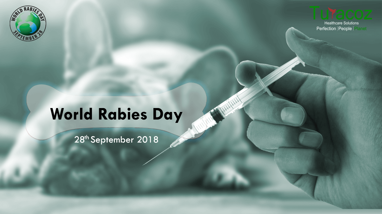
Rabies, a viral disease that is mainly transmitted by an infected animal bite, is a 100% preventable disease. However, it
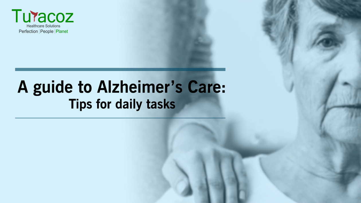
It is estimated that nearly 44 million people worldwide have Alzheimer’s or related dementia. The total number of people with

You might wonder about the title of this article, figuring out how manners can make you a star. But before
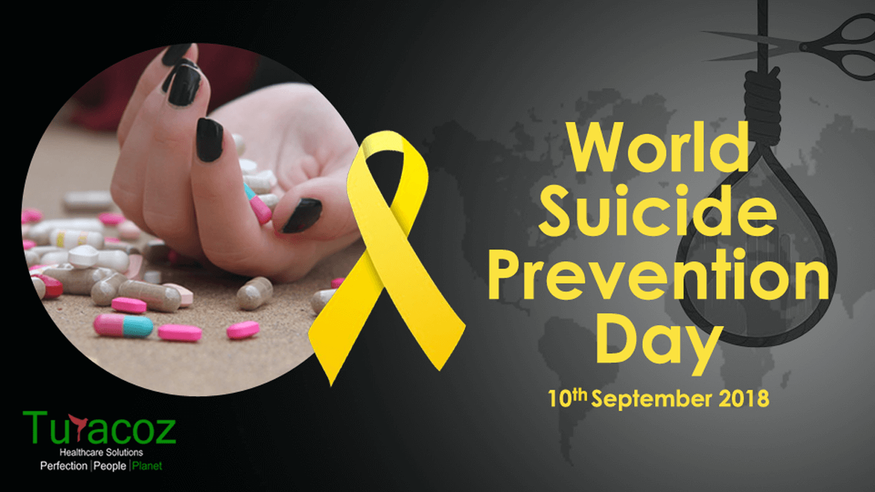
Suicide has become the 3rd highest reason for deaths today in the world, notably among the age group of 15-44
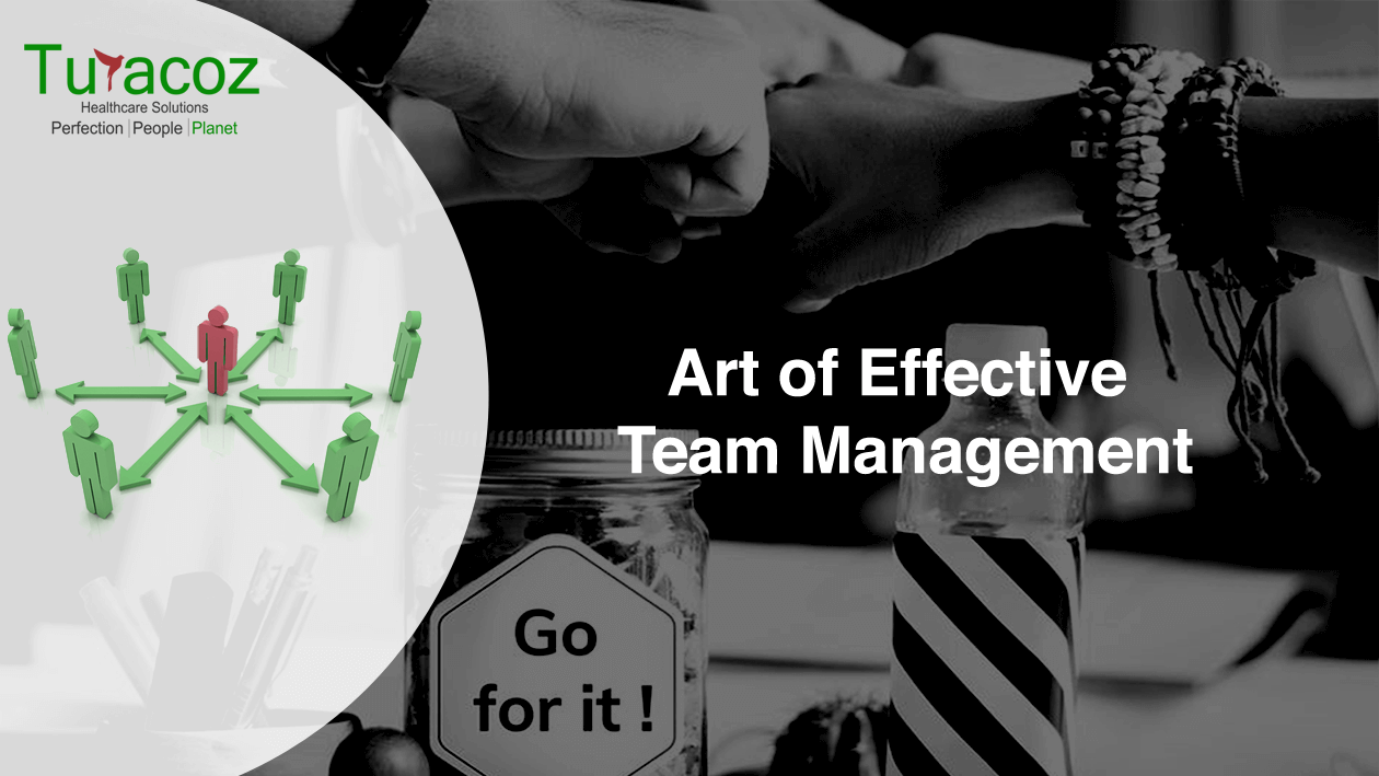
Managing a team to success requires more than just simply assigning tasks to individuals. Handling a team can be exciting, rewarding and exhausting.
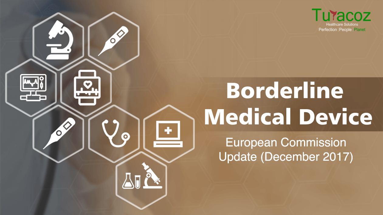
When a device seems to fit onto the definitions of two or more product types, and cannot be clearly classified
The World Senior Citizens Day is observed on 21st August every year with the intention to acknowledge the contributions of

What is an Original Research Article? Original research articles, the primary sources of scientific literature, are considered to have the
“Are you into healthcare advertising?” “Yes!” “Oh! It involves so much medical jargon, and little opportunity for creativity! Do you
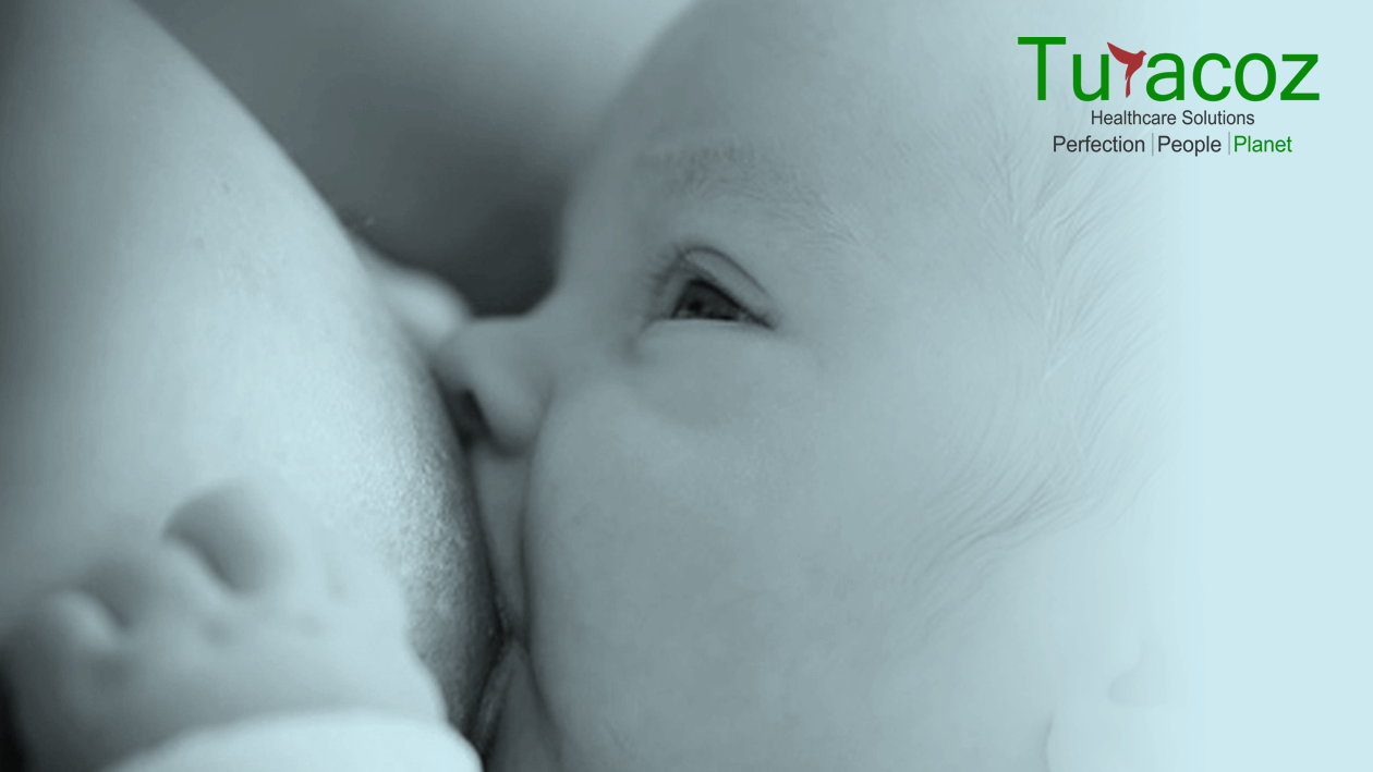
With the World Breastfeeding Week (1st Aug-7th Aug) towards its wrap for the year 2018, Turacoz Healthcare Solutions brings to
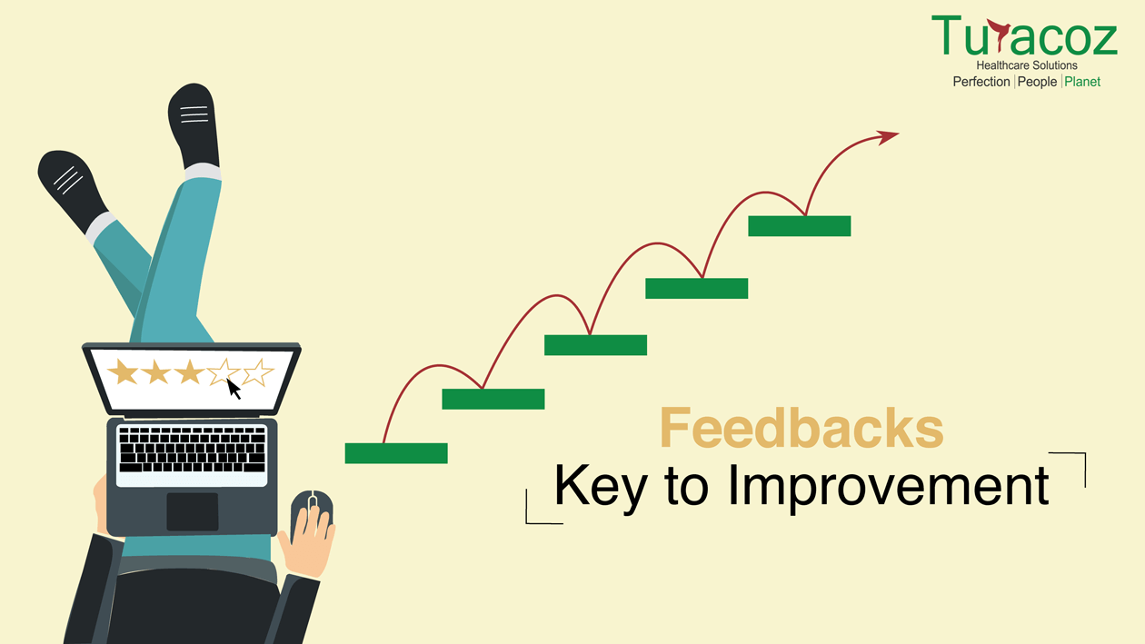
“Feedback is the key to improvement.” I wish giving feedback was as easy as it is to write down

On 6th July 2018, Turacoz Healthcare Solutions organized an eventful and interactive workshop on “Best practices for Scientific Writing
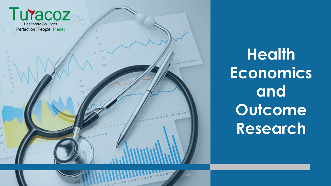
Health economics and outcomes research (HEOR) activities comprise of Pharmacoeconomics (PE) research and health technology assessment (HTA) activities. Health economics

People have argued about the concept of “Work-Life Balance” for decades and it implies something distinctive to everybody. Some might
The medical device industry is undergoing a surge in growth, with new products being developed and introduced into the market

With the years passing, International Yoga Day, has received super positive response from people from all walks of life.
A research publication is considered as the highest-level medium of dissemination of research findings. Scholarly publications play an important role in

On May 2018, Turacoz Skill Development Program (TSDP), a wing of Turacoz Healthcare Solutions signed a MoU with Chitkara University,

Turacoz conducted a workshop on “Literature Search and Lifecycle of a Manuscript” in 1mg Technologies, Gurugram on 10th April 2018.
India – Turacoz Skill Development Program (TSDP) is an initiative of Turacoz Healthcare Solutions, a knowledge partner for medical evidence

Acceliant, the global leader in e-clinical data management solutions, has partnered with Turacoz, a leading medical communications company that provides
Turacoz Healthcare Solutions, a medical communications company provides customized and cost-effective services for various types of medical writing documents. A

Women are pivotal contributors to society in their roles as mothers, individuals, family members, and as citizens. When a woman’‘s
World No Tobacco Day (WNTD) is celebrated every year on 31st May, since its beginning in 1988. The main aim
What is graphical abstract? Graphical abstract is a concise and visual/pictorial summary of the main findings of any publication manuscript.
Our current lifestyle revolves around our workplace duties and responsibilities. Every day we spend the major part of our time
“Ready to Beat Malaria” World Malaria Day has become a global phenomenon and is celebrated on 25th April every year
Global Market Scenario for Orphan Drugs Orphan drugs are the drugs which are used for treatment of orphan/ rare diseases.
Introduction Medical device is an essential part of healthcare system. It is utilised for diagnosis, prevention and treatment of the
Introduction Drug regulations can be defined as the overall control of drug by following rules and regulations which are enforced

Over and over we keep hearing about how employees want to feel connected to their work. How much they want
What is a Rare Disease Rare disease refers to a condition that affects fewer people. The World Health Organization (W.H.O)
Rare Disease Day On the 28th of February, rare disease day is celebrated globally every year. This day was established
Work-From-Home (WFH) is one of the main argument topics lately. WFH as well as flexible working hours are the two
Medical devices comprise of a vast range of equipment, ranging from a single pair of tongs to a heart-lung machine.
Clinical Evaluation Report for Medical Devices Clinical evaluation report (CER) is a document containing information regarding clinical evaluation of a
Global Cancer Diagnostics Market The global cancer diagnostics market was estimated to be USD 16.55 billion in year 2016. It

Cancer is the second most common cause of death after heart disease. The treatment of cancer depends upon the type
Healthcare systems are driven by regulations which ensure patient’s access to safe, effective, and high-quality products. Regulations are basically rules
Evidence-based practice (EBP) is defined asthe conscientious, explicit and judicious use of current best evidence in making correct, prompt and

Mergers and acquisitions (M&As) refer to consolidation of companies or assets. Merger means combining two companies into one, while acquisition

The term diabetes mellitus is defined as a metabolic disorder which is characterized by hyperglycemia with disturbances of carbohydrate, fat
When the balance of body’s metabolic processes is disrupted, certain conditions arise which are known as ‘metabolic conditions’, of which
Turacoz represented in 13th Pharmacovigilance Conference in Chicago (27-28 Sep) as Speaker and participated as Panel member for discussion on
Alzheimer’s Disease (AD) is emerging as one of the critical public health concerns among elderly in various countries around the
Healthcare professionals are expected to provide the best evidence based care to the patients. However, due to continuous medical advancements,

We all are aware of the different types of publication documents, and meta-analysis is one of those documents with the
The Indian healthcare industry is on a high growth trajectory and undergoing transformation across the continuum since the last decade.
Oral health is an integral part of our general health, yet is the most neglected one. The Indian Dental Association
Nations around the globe celebrate World Blood Donor Day (WBDD), every year, on 14th June. The event was established in
IMRAD is nothing but the acronym used for the 4 basic sections of an original research article, namely Introduction, Methods,

A yearly celebration since 1987, ‘World No Tobacco Day’ observed on 31st of May, is an initiative by World Health
World Health Organization (WHO) celebrates 7th of April every year, as World Health Day to mark the anniversary of WHO
World Down Syndrome Day (WDSD) is a global awareness day which has been officially observed by the United Nations since

A lot of talking about Mediterranean food and its benefits has been doing the rounds for quite some time now.
5 Medical Writing Tips for Novice Writers Always start with an outline and ensure that all the relevant questions are
Know About the DASH Plan “DASH” or the Dietary Approaches to Stop Hypertension (DASH) is an eating plan which can
Under the aegis of Turacoz Healthcare Solutions, Turacoz Skill Development Program conducted a seminar on medical writing at the National
Facts Approximately 83% of liver cancer cases are diagnosed in developing regions of the world. 1 year survival rate of
“Love Your Bones and Protect Your Future” World Osteoporosis Day is observed every year on October 20, with a year-long

Desktop dining has now become a common phenomenon with approximately 65% of working professionals typically having lunch at their desks
October is the “Breast Cancer Awareness Month”. Breast cancer is the second most common cause of death due to cancer
Cardiovascular diseases (CVDs) are a group of disorders of the heart and the blood vessels which include coronary heart disease,
This year marks the 10th World Rabies Day, which has become a global phenomenon since its beginning in the year
Turacoz is a medical communications company providing customized and cost-effective solutions to healthcare and pharma industries. The team of young,
Editing is an important task that is performed by an editor with a good scientific background and good editing skills.
Medical writing is a multidimensional profession which requires creating numerous scientific/non-scientific documents for various phases of a drug life-cycle. Different
What is Triclosan? Triclosan is commonly used as a disinfectant or an antiseptic to reduce and control the bacterial contamination.
Being a medical writer has a lot of allure, particularly if you are having a flexible work schedule, competitive salary

As the cool showers of monsoon bring relief after the torrid summers, the warm humid weather also brings numerous skin
Disturbed sleep and strained red eyes seem to take a back seat as we stand face-to-face with a much more
Viral hepatitis, an inflammatory liver disease is commonly caused by hepatitis A, B, C, D, or E virus. In 2013,
Introduction Dehydration is a condition where free water loss exceeds free water intake. Around 2/3rd of the human body is composed
Turacoz attended 6thAisa- Pacific Pharma congress organized by Omics International on 12th July,2016 at Kuala Lumpur, Malaysia.The aim of the

Humans were designed to move around and stay physically active. However, over the period of time, we evolved technologically and
Diabetes mellitus (DM) has become one of the most challenging health problems in the 21st century. It is a serious
Helen Adams Keller (June 27, 1880 – June 1, 1968) was an American author, political activist, and lecturer. She was

It’s again Ramadan time. Millions of Muslims fast during this period and abstain from eating and drinking. However, two main
Turacoz Healthcare Solutions, a medical communications company will be attending 6th Asia-Pacific Pharma Congress where, Dr. Namrata Singh, director of

Surya Namaskar or sun salutation is a way of saluting sun, the ultimate source of energy and life on earth.
Men’s Health Month is a special awareness period for men’s health observed across the globe. It was passed by Congress

Ramadan is a holy month for Muslims in which consumption of food and drinks, medications, and smoking is forbidden between

Turacoz skill development program conducted a medical writing workshop on publication at Tata memorial hospital, Mumbai on 4th June,2016. The
Turacoz skill development program conducted a seminar on 02 June, 2016 in Center for Faculty Development (Faculty of Pharmacy), Jamia
It’s not just a pain.It’s a complete physical, mental, and emotional assault on your body. -Jamie Wingo May is declared

Turacoz Skill and Development program under the umbrella of Turacoz Healthcare Solutions successfully organized its second Medical Writing workshop in

The month of May is declared as “National Asthma and Allergy Awareness Month” by Asthma and Allergy Foundation of America.
“For Hepatitis, Prevention is the Best Intervention” The month of May is titled as “Hepatitis Awareness Month”, as a proactive
Malaria is a serious life-threatening parasitic disease caused by parasites known as Plasmodium vivax (P.vivax), Plasmodium falciparum (P.falciparum), Plasmodium malariae
Turacoz Healthcare Solutions conducted a medical writing workshop on 16th April, 2016 at Country Inn and suites by Carlson, Bangalore.
Let’s Join Hands to Fight Against Hemophilia Hemophilia is one of the oldest known genetic bleeding disorder which is caused
The Department of Pharmaceuticals (DoP), Government of India, released Uniform Code of Pharmaceuticals Marketing Practices (UCPMP) on 1st January 2015.
Autism is a serious, lifelong developmental disability characterized by considerable impairments in social interactions and communication skills, as well as
World Parkinson’s Disease Day: 11th April, 2016: World Parkinson’s disease day is celebrated every year on 11th April to commemorate
Tuberculosis (TB) is an infectious disease caused by the bacillus Mycobacterium tuberculosis. It usually affects the lungs (pulmonary TB), but
Overview : Colorectal cancer is the abnormal growth of cells in the colon or rectum (parts of the large intestine) that

World Glaucoma Week (March 6-12, 2016) : Be Informed, Be Safe Each year the World Glaucoma Association (WGA) and the


World Kidney Day (WKD) is a joint initiative of the International Society of Nephrology (ISN) and the International Federation of Kidney
Turacoz conducted a seminar on Medical writing as a career for over 125 students with Biotechnology and Life sciences background
Turacoz conducted a Medical writing workshop on February 16th, Tuesday at Radisson Blu GRT, Chennai. It is one of the
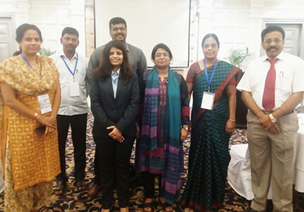
Turacoz’s Medical Director, Dr. Namrata Singh was present at the InnoHealth conference held on February 5th at PHD house, Chamber
Turacoz Healthcare Solutions conducted a Medical Writing Workshop in Dubai on 30th January 2016 at Radisson Blu Downtown. The participants
Arab Health Congress is one of the biggest, largest and most extravagant confluence for the pharmaceutical and healthcare professionals. It
February 12 is declared as Sexual and Reproductive Health Awareness Day annually. This day provides an opportunity to raise awareness
Air pollution is the introduction of chemicals, particulate matters or biological materials in air, for a sufficient time that causes
What is a Publication? Publications are a healthcare solution which bridges communication of research conducted to the researchers around the
“Anyone who stops learning is old, whether at twenty or eighty. Anyone who keeps learning stays young. The greatest thing

Practice Flawless English for Good Scientific Writing Knowledge of grammar is one of the keys to writing clearly and credibly.
It is believed that around 1920, a deadly virus crossed species from chimpanzees to humans in Kinshasa (Africa), and led
World AIDS Day, 1 Dec was first declared by the World Health Organization and the United Nations General Assembly in
‘Medical writing’ is a perfect amalgamation of science and art. As a medical writer, one has to maintain a good
As described by the WHO, immunization is the process whereby a person is made immune or resistant to an infectious
Over the years there are many technological advancements that came into light in the treatment of diabetes. These technological advancements
Clinical studies are conducted to test the drugs and medical devices in humans before their approval and availability for the
Reduce your risk today: Eat healthy, Walk more and Weigh less Lifestyle modification for prevention of diabetes mellitus Structured programs
Publishing the results of a study completes the research conducted. As mentioned by EH Miller, “If it was not published,
Knocking out Triple Negative Breast Cancer: A new paradigm in treatment Triple negative breast cancer (TNBC) are the subtypes of


Liver cancer: Treatment Liver cancer treatment is generally based on the stage of disease and the patient response to treatment.
Since 1997, October 20, is observed as the “World Osteoporosis Day” for raising global awareness on the prevention, diagnosis and

Protect yourself from Breast Cancer Over last ten years or so, breast cancer is the most common cancer in most
What is liver cancer or hepatic cancer? Liver is the largest internal organ in the body. It is essential for
“A heart for life” World Heart Day (sponsored by World Heart Federation) was founded in 2000, a biggest intervention against
September is Prostate Cancer Awareness month Globally, prostate cancer is the second most frequently diagnosed cancer in men and the

World contraception day (WCD) was first conceived in the year 2007 by 10 international family planning organizations in order to
Understanding environmental health The International Federation of Environmental Health, better known by its acronym IFEH, works to impart knowledge regarding
Newborn screening test (also known as Guthrie test) is one of the successful innovations in the modern era. It is

Fast Facts 2 A genetic disease, resulting from environmental (gluten) and genetic (HLA and non-HLA genes) factors. Estimated 1 %
Attempting Suicide and having suicidal tendency are the most extreme form of self-harming behaviour exhibited by humans. Centre for Disease
Psoriasis is not all of you, it is just a part of you like everything else Psoriasis is generally classified

Dr. Namrata’s mantra for life is “nothing is impossible”. Her experience of 10 years as a pediatrician and 9 years

Today on Organ Donation day, Turacoz team members pledge their organs for a noble cause and want to contribute to
“Once you choose hope, anything’s possible.” Christopher Reeve Sarcoma, may be defined as “a malignant tumor of connective or other

The 5 tips for desktop workers are absolutely essential to maintain and good health and have a long innings professionally.
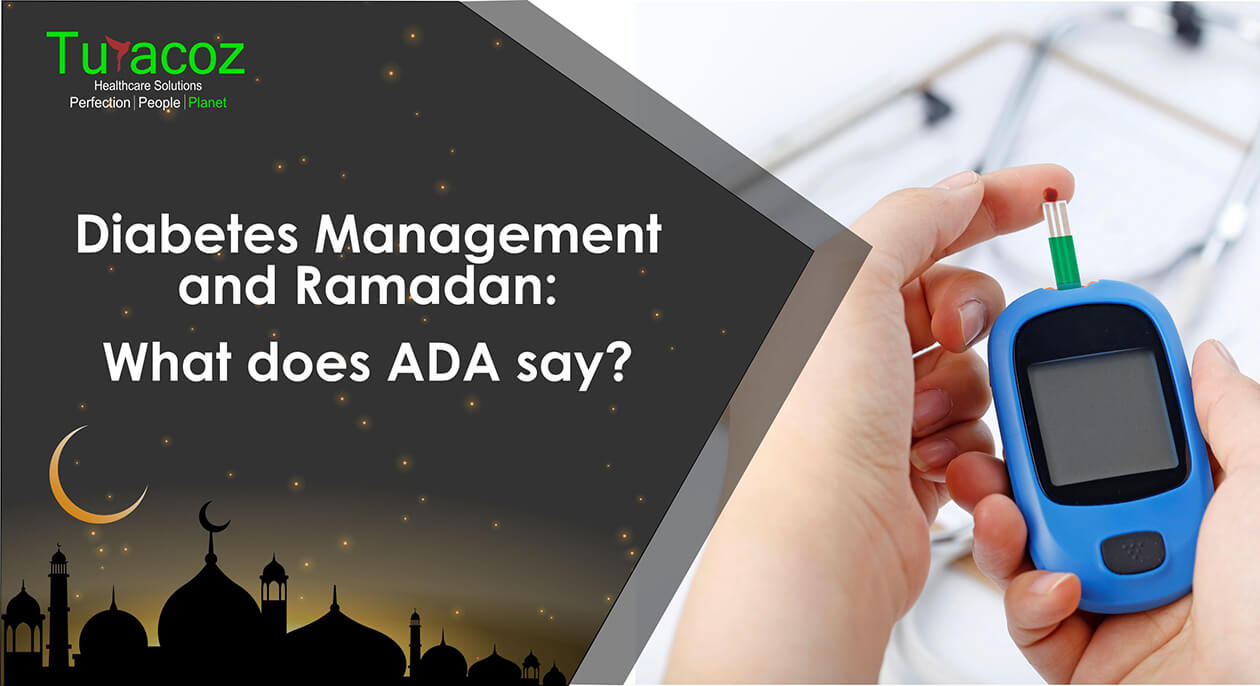
Ramadan is a lunar based fasting month for Muslims. Muslims who fast during this time should refrain from eating, drinking,
Sarcomas are the tumors originating from mesenchyme and contribute to about 20% of all pediatric solid malignant cancers and less
Yoga has been an integral part of India since Indus Saraswati civilization for about 5000 years now. With time the
Asthma is a worldwide disease affecting an estimated 300 million individuals globally. Some authors also reported prevalence of Asthma as
“In three words I can sum up everything I’ve learned about life: it goes on.” ― Robert Frost Hemophilia- a
Duis ornare, est at lobortis mollis, felis libero mollis orci vitae dictum lacus quis neque lectus vel neque. Aliquam ultrices erat lobortis.
Duis ornare, est at lobortis mollis, felis libero mollis orci, vitae congue neque lectus vel neque. Aliquam ultrices erat.

Partner with Turacoz to bring science to life through strategic and evidence-based communication.